Wednesday, December 28, 2011

SVD and covariance matrices

This post describes singular value decomposition (SVD) and how it applies to covariance matrices.  As we will see in later posts, SVD and covariance matrices are central to understanding principal components analysis (PCA), linear regression, and multivariate Gaussian probability distributions.

SVD

Singular value decomposition (SVD) decomposes a matrix X into three matrices U, S, and V such that:
  X = U*S*V'
The columns of U are mutually orthogonal unit-length vectors (these are called the left singular vectors); the columns of V are mutually orthogonal unit-length vectors (these are called the right singular vectors); and S is a matrix with zeros everywhere except for non-negative values along the diagonal (these values are called the singular values).

% Let's see an example.
X = randn(10,3);
[U,S,V] = svd(X);
figure; setfigurepos([100 100 500 150]);
subplot(1,3,1); imagesc(U'*U); axis image square; colorbar; title('U^TU');
subplot(1,3,2); imagesc(V'*V); axis image square; colorbar; title('V^TV');
subplot(1,3,3); imagesc(S); axis image square; colorbar; title('S');


Notice that U'*U and V'*V are identity matrices.  This makes sense because the sum of the squares of the coordinates of a unit-length vector equals one and because the dot product of orthogonal vectors equals zero.

Covariance matrices

Suppose X represents a set of linear regressors.  That is, suppose the dimensions of X are m x n, representing n regressors defined in an m-dimensional space.  Then, X'*X is an n x n covariance matrix, representing the covariance of each regressor with each other regressor.  (Technically, this is not quite correct: true covariance involves subtracting off the mean of each regressor before calculating the pairwise dot-products and dividing the results by the number of elements in each regressor (m).  Nevertheless, it is still useful to think of X'*X as a covariance matrix.)

SVD applied to covariance matrices

SVD provides a useful decomposition of covariance matrices:
  X'*X = (U*S*V')'*(U*S*V') = V*S'*U' * U*S*V' = V*S.^2*V'
where S.^2 is a diagonal matrix consisting of zeros everywhere except for non-negative values along the diagonal (these values are the square of the values in the original S matrix).

X'*X is an n x n matrix that can be interpreted as applying a linear operation to n-dimensional space.  For instance, suppose we have a vector v with dimensions n x 1.  This vector corresponds to a specific point in n-dimensional space.  If we calculate (X'*X)*v, we obtain a new vector corresponding to a new point in n-dimensional space.

The SVD decomposition of X'*X gives us insight into the nature of the linear operation.  Specifically, the SVD decomposition tells us that the linear operation consists of three successive operations: a rotation, a scaling, and then an undoing of the original rotation:
  1. The initial rotation comes from multiplication with V'.  This is because the columns of V form a complete orthonormal basis (each column is a unit-length vector and all columns are orthogonal to one another).  Multiplication of V' and v projects the vector v onto the basis.  Change of basis simply rotates the coordinate system.
  2. The scaling comes from multiplication with S.^2.  Since S.^2 is a diagonal matrix, multiplication with S.^2 simply stretches the coordinate system along the axes of the coordinate system.
  3. The final rotation comes from multiplication with V.  This multiplication undos the rotation that was performed by the initial multiplication with V'.
% Let's see an example.
X = unitlength(zeromean(randnmulti(1000,[],[1 .6; .6 1]),1),1);
figure; setfigurepos([100 100 300 300]);
imagesc(X'*X,[0 1]);
axis image square;
colorbar;
title('Covariance matrix: X^TX');


% In this example there are 2 regressors defined in a 1000-dimensional space.
% The regressors are moderately correlated with one another, as can be seen
% in the relatively high off-diagonal term in the covariance matrix.

% Let's use SVD to interpret the operation performed by the covariance matrix.
[U,S,V] = svd(X);
angs = linspace(0,2*pi,100);
vectors = {};
circlevectors = {};
vectors{1} = eye(2);
circlevectors{1} = [cos(angs); sin(angs)];
vectors{2} = V'*vectors{1};
circlevectors{2} = V'*circlevectors{1};
vectors{3} = S'*S*vectors{2};
circlevectors{3} = S'*S*circlevectors{2};
vectors{4} = V*vectors{3};
circlevectors{4} = V*circlevectors{3};
  % now perform plotting
figure; setfigurepos([100 100 600 200]);
colors = 'rg';
titles = {'Original space' '(1) Rotate' '(2) Scale' '(3) Un-rotate'};
for p=1:4
  subplot(1,4,p);
  axis([-1.8 1.8 -1.8 1.8]); axis square; axis off;
  for q=1:2
    drawarrow(zeros(1,2),vectors{p}(:,q)',[colors(q) '-'],[],5);
  end
  plot(circlevectors{p}(1,:),circlevectors{p}(2,:),'k-');
  title(titles{p});
end


% The first plot shows a circle in black and equal-length vectors oriented
% along the coordinate axes in red and green.  The second plot shows what
% happens after the initial rotation operation.  The third plot shows what
% happens after the scaling operation.  The fourth plot shows what happens
% after the final rotation operation.  Notice that in the end result, the
% red and green vectors are no longer orthogonal and the circle is now an ellipse.

% Let's visualize the linear operation once more, but this time let's use
% the red and green vectors to represent the columns of the V matrix.
vectors = {};
vectors{1} = V;
vectors{2} = V'*vectors{1};
vectors{3} = S'*S*vectors{2};
vectors{4} = V*vectors{3};
% run the "now perform plotting" section above


% Compare the first plot to the last plot.  Notice that red and green vectors
% have not changed their angle but only their magnitude --- this reflects the
% fact that the columns of the V matrix are eigenvectors of the covariance matrix.
% Multiplication by the covariance matrix scales the space along the directions
% of the eigenvectors, which has the consequence that only the magnitudes of
% the eigenvectors, and not their angles, are modified.

Sunday, December 25, 2011

Importance of error bars on data points when evaluating model quality

When measuring some quantity, the same value might not be obtained across repeated measurements --- in other words, noise may exist in the measurements.  Some portion of the noise might be due to factors that can be controlled for, and if these factors are controlled for, then the noise level could potentially be reduced.  However, for sake of the present discussion, let's assume that the noise present in a given situation can neither be controlled nor predicted.

When evaluating how well a model characterizes a given dataset, it is important to take into account the intrinsic noisiness of the data.  This is because a model cannot be expected to predict all of the data, as doing so would imply that the model predicts even the portion of the data that is due to noise (which, by our definition, is unpredictable).

Let's illustrate these ideas using a simple set of examples:


The top-left scatter plot shows some data (black dots) and a linear model (red line).  The model does fairly well capturing the dependency of the y-coordinate on the x-coordinate.  However, there are no error bars on the data points, so we lack critical information.  Our interpretation of the model and the data will be quite different, depending on the size of the error bars.

The upper-right scatter plot shows one possible case: the error on the data points is relatively small.  In this case there is a large amount of variance in the data that is both real (i.e. not simply attributable to noise) and not accounted for by the model.

The lower-left scatter plot shows another possible case: the error on the data points is relatively large.  In this case there appears to be very little variance in the data that is both real and not accounted for by the model.

The lower-right scatter plot shows one last case: the error on the data points is extremely large.  This case is in fact nearly impossible, and suggests that the error bar estimates are inaccurate.  We will examine this case in more detail later.

CODE

% CASE A:
% We have a model and it is the optimal characterization of the data.
% The only failure of the model is its inability to predict the
% noise in the data.  (Note that this case corresponds to case 2
% in the initial set of examples.)
noiselevels = [10 2];
figure(999); setfigurepos([100 100 500 250]); clf;
for p=1:length(noiselevels)
  x = linspace(1,9,50);
  y = polyval([1 4],x);
  subplot(1,2,p); hold on;
  measurements = bsxfun(@plus,y,noiselevels(p)*randn(10,50));  % 10 measurements per data point
  mn = mean(measurements,1);
  se = std(measurements,[],1)/sqrt(10);
  h1 = scatter(x,mn,'k.');
  h2 = errorbar2(x,mn,se,'v','k-');
  h3 = plot(ax(1:2),polyval([1 4],ax(1:2)),'r-');
  xlabel('x'); ylabel('y');
  legend([h1 h2(1) h3],{'Data' 'Error bars' 'Model'},'Location','SouthEast');
  r2 = calccod(y,mn);
  dist = calccod(repmat(y,[10000 1]),bsxfun(@plus,y,sqrt(mean(se.^2))*randn(10000,50)),2);
  title(sprintf('R^2 = %.0f%%; maximum R^2 = [%.0f%% %.0f%%]',r2,prctile(dist,2.5),prctile(dist,97.5)));
  if p==1
    ax = axis;
  end
  axis(ax);
end


% We have conducted two simulations.  In both simulations, there is a simple linear
% relationship between x and y.  Assuming this linear relationship, we have generated
% 10 measurements of y for various fixed values of x, and we have plotted the mean and
% standard error of these measurements.  In the simulation on the left, the noise level
% is relatively high, whereas in the simulation on the right, the noise level is relatively
% low.  The R^2 between the model and the data is 35% and 92% for the first and
% second simulations, respectively.  (For now, ignore the reported "maximum R^2"
% values, as these will be explained later.)
%
% What these simulations demonstrate is that (1) an optimal model can produce very
% different R^2 values, depending on the level of noise in the data and (2) if a model
% passes through or close to the error bars around most data points, the model may be
% nearly, if not fully, optimal.

% CASE B:
% We have a model and it characterizes the data only to a limited extent.
% The model fails to characterize aspects of the data that do not
% appear to be merely due to measurement noise.  (Note that this case
% corresponds to case 1 in the initial set of examples.)
noiselevel = 2;
figure(998); setfigurepos([100 100 250 250]); clf; hold on;
x = linspace(1,9,50);
y = polyval([1 4],x);
measurements = bsxfun(@plus,y + 4*randn(1,50),noiselevel*randn(10,50));
mn = mean(measurements,1);
se = std(measurements,[],1)/sqrt(10);
h1 = scatter(x,mn,'k.');
h2 = errorbar2(x,mn,se,'v','k-');
h3 = plot(ax(1:2),polyval([1 4],ax(1:2)),'r-');
xlabel('x'); ylabel('y');
legend([h1 h2(1) h3],{'Data' 'Error bars' 'Model'},'Location','SouthEast');
r2 = calccod(y,mn);
dist = calccod(repmat(y,[10000 1]),bsxfun(@plus,y,sqrt(mean(se.^2))*randn(10000,50)),2);
title(sprintf('R^2 = %.0f%%; maximum R^2 = [%.0f%% %.0f%%]',r2,prctile(dist,2.5),prctile(dist,97.5)));


% In this simulation, there is an overall linear relationship between x and y
% (as indicated by the red line).  However, this relationship does not fully
% characterize the y-values --- there are many data points that deviate
% substantially (many standard errors away) from the model.  The R^2 between
% the model and the data is just 7%.
%
% Given the relatively low noise level in the data, it intuitively seems that
% a much higher R^2 value should be possible.  For example, perhaps there is
% another regressor (besides the x-coordinate) that, if added to the model,
% would substantially improve the model's accuracy.  Without getting into the
% issue of how to improve the current model, we can use a simple set of
% simulations to confirm that the current R^2 value is indeed not optimal.
% First, we assume that the current model's prediction of the data points
% are the true (noiseless) y-values.  Then, we generate new sets of
% data by simulating measurements of the true y-values; for these
% measurements, we match the noise level to that observed in the actual
% dataset.  Finally, we calculate the R^2 between the model and the
% simulated datasets.  The 95% confidence interval on the resulting R^2
% values is indicated as the "maximum R^2" values in the title of the figure.
%
% The results of the simulations show that for our example,
% the R^2 value that we can expect to attain is at least 88%.  This
% confirms our suspicion that the current R^2 value of 7% is suboptimal.

% CASE C:
% We have a model and it appears to characterize the data quite well.
% In fact, the regularity and predictability of the data appear to be
% higher than what would be expected based on the large error bars
% on the data points.  (Note that this case corresponds to case 3 in the
% initial set of examples.)
noiselevel = 10;
figure(997); setfigurepos([100 100 250 250]); clf; hold on;
x = linspace(1,9,30);
y = polyval([1 4],x);
measurements = bsxfun(@plus,y,noiselevel*randn(10,30));
mn = mean(measurements,1);
se = std(measurements,[],1)/sqrt(10);
mn = .3*mn + .7*y;  % a simple hack to make the data better than it should be
h1 = scatter(x,mn,'k.');
h2 = errorbar2(x,mn,se,'v','k-');
h3 = plot(ax(1:2),polyval([1 4],ax(1:2)),'r-');
xlabel('x'); ylabel('y');
legend([h1 h2(1) h3],{'Data' 'Error bars' 'Model'},'Location','SouthEast');
r2 = calccod(y,mn);
dist = calccod(repmat(y,[10000 1]),bsxfun(@plus,y,sqrt(mean(se.^2))*randn(10000,30)),2);
title(sprintf('R^2 = %.0f%%; maximum R^2 = [%.0f%% %.0f%%]',r2,prctile(dist,2.5),prctile(dist,97.5)));


% In this simulation, the model characterizes the data quite well,
% with an R^2 value of 80%.  However, performing the same
% "maximum R^2" calculations described earlier, we find
% that the 95% confidence interval on the R^2 values that we
% can expect given the noise level in the data is [2%, 58%].
% This indicates that the model is, in a sense, doing too well.
% The problem might be due to inaccuracy of the error bar
% estimates: perhaps the error bar estimates are larger than
% they should be, or perhaps the errors on different data points
% are not independent of one another (the assumption of
% independence is implicit in the calculation of the
% maximum R^2 values).  Resolving tricky problems like
% these requires detailed inspection of the data on a case-
% by-case basis.

Wednesday, December 14, 2011

Noise, model complexity, and overfitting

When building models, ideally we would (1) have plenty of data available and (2) know what model to apply to the data.  If these conditions hold, then we would simply need to estimate the parameters of the model and verify that the model is indeed accurate.  The problem is that in reality, these conditions often do not hold.  That is, we often have limited or noisy data and we often do not know what model is appropriate for the data at hand.  In these cases, we are faced with the task of trying different models and determining which model is best.

It is useful to think of model complexity as a dimension along which models vary.  Complex, flexible models have the potential to describe many different types of functions.  The advantage of such models is that the true model (i.e. the model that most accurately characterizes the data) may in fact be contained in the set of models that can be described.  The disadvantage of such models is that they have many free parameters, and it may be difficult to obtain good parameter estimates with limited or noisy data.  (Or, stated another way: when fitting such models to limited or noisy data, there is a strong possibility of overfitting the data --- that is, a strong possibility that random variability in the data will have too much influence on parameter estimates and give rise to an inaccurate model.)  On the other hand, simple, less flexible models describe fewer types of functions compared to complex models.  The advantage of simple models is that they have fewer free parameters, and so it becomes feasible to obtain good parameter estimates with limited or noisy data.  (Or, stated another way: there is low likelihood that simple models will overfit the data.)  The disadvantage of simple models is that the types of functions that can be described may be poor approximations to the true underlying function.

A priori, it is impossible to say whether a complex or simple model will yield the most accurate model estimate for a given dataset (since it depends on the amount of data available, the nature of the effect, etc.).  We must empirically try different models and evaluate their performance, e.g. using cross-validation.  In this post, we provide a simple example illustrating these concepts.

CODE

% Construct training dataset.
x = linspace(-2,2,30);
modelfun = @(x) x.^4 - 20*x.^3 + 5*x.^2 + 4*x + 1;
y = feval(modelfun,x) + 50*randn(1,length(x));

% Construct testing dataset.
xval = repmat(linspace(-2,2,30),[1 10]);
yval = feval(modelfun,xval) + 50*randn(1,300);

% Define max polynomial degrees to try.
degstodo = 1:10;
degs = [1 3 10];  % display these

% Make a figure.
results = []; ax1 = []; ax2 = [];
figure(999); setfigurepos([100 100 800 600]); clf;
for dd=1:length(degstodo)
  makemodel = @(x) catcell(2,arrayfun(@(n) x'.^n,0:degstodo(dd),'UniformOutput',0));
  X = feval(makemodel,x);
  recboot = fitprfstatic(X,y',0,0,[],100,[],[],[],@calccod);  % bootstrap
  rec     = fitprfstatic(X,y',0,0,[],0,[],[],[],@calccod);    % full fit
  pred = feval(makemodel,xval)*rec.params';
  results(dd,1) = rec.r;  % training R^2
  results(dd,2) = calccod(pred,yval');  % testing R^2
  modelfits = [];
  for p=1:size(recboot.params,1)
    modelfits(p,:) = X*recboot.params(p,:)';
  end
  iii = find(ismember(degs,degstodo(dd)));
  if ~isempty(iii)
    subplot(length(degs),2,(iii-1)*2+1); hold on;
    h1 = scatter(x,y,'k.');
    mn = median(modelfits,1);
    se = stdquartile(modelfits,1,1);
    [d,ix] = sort(x);
    h2 = errorbar3(x(ix),mn(ix),se(ix),'v',[1 .8 .8]);
    h3 = plot(x(ix),mn(ix),'r-');
    h4 = plot(x(ix),feval(modelfun,x(ix)),'b-');
    uistack(h1,'top');
    xlabel('x'); ylabel('y');
    legend([h1 h3 h2 h4],{'Data' 'Model fit' 'Error bars' 'True model'},'Location','NorthEastOutside');
    ax1(iii,:) = axis;
    axis(ax1(1,:));
    title(sprintf('Max polynomial degree = %d',degstodo(dd)));

    subplot(length(degs),2,(iii-1)*2+2); hold on;
    bar(0:degstodo(dd),median(recboot.params,1));
    errorbar2(0:degstodo(dd),median(recboot.params,1),stdquartile(recboot.params,1,1),'v','r-');
    set(gca,'XTick',0:degstodo(dd));
    xlabel('Polynomial degree');
    ylabel('Estimated weight');
    ax = axis;
    axis([-1 max(degstodo)+1 ax(3:4)]);
    ax2(iii,:) = axis;
  end
end


% We have created a dataset in which there is a nonlinear relationship
% between x and y.  The observed data points are indicated by black dots,
% and the true relationship is indicated by a blue line.  We have fit three
% different models to the data: a linear model (max polynomial degree of 1),
% a cubic model (max polynomial degree of 3), and a model that includes
% polynomials up to degree 10.  For each model, we have bootstrapped the
% fits, allowing us to see the variability of the model fit (pink error bars
% around the red line), as well as the variability of the parameter
% estimates (red error bars on the vertical black bars).
%
% There are several important observations:
% 1. The cubic model gives the most accurate model estimate.  The linear model
%    underfits the data, while the 10th degree model overfits the data.
% 2. In the cubic and 10th degree models, we estimate weights on higher
%    polynomials, and this changes the estimated weights on the lower
%    polynomials.  The change in weights indicates that the lower and higher
%    polynomials have correlated effects in the data.  In general, correlated regressors
%    are not necessarily problematic.  However, in the given dataset, we do not
%    have much data available and the influence of the higher polynomials is
%    weak (in fact, there are no polynomials beyond degree 4 in the true model).
%    Thus, we are better off ignoring the higher polynomials than attempting to
%    include them in the model.

% Because the data were generated from a known model, we can compare
% the various models to the known model in order to see which model is
% most accurate.  However, in general, we do not have access to the true,
% underlying model.  Instead, what we can do is to use cross-validation to
% quantify model accuracy.
figure(998); clf; hold on;h = plot(results,'o-');
h2 = straightline(calccod(feval(modelfun,xval),yval),'h','k-');
legend([h' h2],{'Training' 'Testing' 'Testing (true model)'});
set(gca,'XTick',1:length(degstodo),'XTickLabel',mat2cellstr(degstodo));
ax = axis;
axis([0 length(degstodo)+1 0 ax(4)]);
xlabel('Max polynomial degree');
ylabel('Variance explained (R^2)');


% In this figure, we see that increasing the maximum polynomial degree invariably
% increases performance on the training data.  However, we see that increasing
% the maximum polynomial degree only increases performance on the testing data
% up to a degree of 3.  Beyond degree 3, the additional higher-order polynomials
% causes the model to overfit the training data and produces model estimates
% that perform more poorly on the testing data.  Thus, by using cross-validation we
% have found that the cubic model is the most accurate model.
%
% Notice that the performance of the cubic model is nevertheless still lower than
% that of the true model.  In order to improve the performance of our model
% estimate, we either have to change our modeling strategy (e.g. change the
% model, use regularization in parameter estimation) or collect more data.
% But in the end, there is no magic bullet --- achieving imperfect models is
% an inevitable feature of model building!

Saturday, December 10, 2011

Model accuracy vs. model reliability

In previous posts, we looked at cross-validation and bootstrapping in the context of regression.  Cross-validation and bootstrapping are similar in that both involve resampling the data and then fitting a model of interest.  In cross-validation, we fit a model of interest to a subset of the data and then evaluate how well the model predicts the remaining data.  In bootstrapping, we create bootstrap samples by drawing with replacement from the original data and then fit a model of interest to each bootstrap sample.  However, despite this superficial similarity, the two methods have fundamentally different purposes: cross-validation quantifies the accuracy of a model whereas bootstrapping quantifies the reliability of a model.

CODE

% Let's distill the distinction between accuracy and reliability
% down to its core and look at a very simple example.
figure(999); clf; hold on;
h1 = scatter(1,7,'ro');
h2 = scatter(1,4,'bo');
h3 = errorbar2(1,4,1,'v','b-');
axis([0 2 0 12]);
legend([h1 h2 h3],{'True model' 'Estimated model' 'Error bars'});
ylabel('Value');
set(gca,'XTick',[]);


% In this example, we have a single number indicated by the red dot,
% and we are trying to match this number with a model.  Through some
% means we have estimated a specific model, and the prediction of the
% model is indicated by the blue dot.  Moreover, through some means we
% have estimated error bars on the model's prediction, and this is
% indicated by the blue line.

% Now let's consider the accuracy and reliability of the estimated
% model.  The accuracy of the model corresponds to how far the
% estimated model is away from the true model.  The reliability
% of the model corresponds to how variable the estimated model is.
h4 = drawarrow([1.3 4.5],[1.03 4.52],'k-',[],10);
h5 = text(1.33,4.5,'Reliability');
h6 = plot([.95 .9 .9 .95],[7 7 4 4],'k-');
h7 = text(.88,5.5,'Accuracy','HorizontalAlignment','Right');


% Accuracy and reliability are not the same thing, although they do bear
% certain relationships to one another.  For example, if reliability is
% low, then it is likely that accuracy is low.  (Imagine that the error bar
% on a given model is very large.  Then, we would expect that any given
% estimate of the model would be not well matched to the true model.)
% Conversely, if accuracy is high, then it is likely that reliability
% is also high.  (If a model estimate predicts responses extremely
% well, then it is likely that the parameters of the model are well
% estimated.)
%
% However, an important case to keep in mind is that it is possible for a
% model to have high reliability but low accuracy.  To see how this can
% occur, let's examine each possible configuration of accuracy and
% reliability.

% CASE 1: MODEL IS RELIABLE AND ACCURATE.
%   In this case, there are enough data to obtain good estimates of
%   the parameters of the model, and the model is a good description
%   of the data.  Let's see an example (quadratic model fitted to
%   quadratic data).
x = rand(1,100)*14 - 8;
y = -x.^2 + 2*x + 4 + 6*randn(1,100);
rec = fitprfstatic([x.^2; x; ones(1,length(x))]',y',0,0,[],100,[],[],[],@calccod);
figure(998); clf; hold on;
h1 = scatter(x,y,'k.');
ax = axis;
xx = linspace(ax(1),ax(2),100);
X = [xx.^2; xx; ones(1,length(xx))]';
modelfits = [];
for p=1:size(rec.params,1)
  modelfits(p,:) = X*rec.params(p,:)';
end
mn = median(modelfits,1);
se = stdquartile(modelfits,1,1);
h2 = errorbar3(xx,mn,se,'v',[.8 .8 1]);
h3 = plot(xx,mn,'b-');
h4 = plot(xx,-xx.^2 + 2*xx + 4,'r-');
uistack(h1,'top');
xlabel('x'); ylabel('y');
legend([h1 h4 h3 h2],{'Data' 'True model' 'Estimated model' 'Error bars'});
title('Model is reliable and accurate');


% CASE 2: MODEL IS RELIABLE BUT INACCURATE.
%   In this case, there are enough data to obtain good estimates of
%   the parameters of the model, but the model is a bad description
%   of the data.  Let's see an example (linear model fitted to
%   quadratic data).
x = rand(1,100)*10 - 5;
y = x.^2 - 3*x + 4 + 1*randn(1,100);
rec = fitprfstatic([x; ones(1,length(x))]',y',0,0,[],100,[],[],[],@calccod);
figure(997); clf; hold on;
h1 = scatter(x,y,'k.');
ax = axis;
xx = linspace(ax(1),ax(2),100);
X = [xx; ones(1,length(xx))]';
modelfits = [];
for p=1:size(rec.params,1)
  modelfits(p,:) = X*rec.params(p,:)';
end
mn = median(modelfits,1);
se = stdquartile(modelfits,1,1);
h2 = errorbar3(xx,mn,se,'v',[.8 .8 1]);
h3 = plot(xx,mn,'b-');
h4 = plot(xx,xx.^2 - 3*xx + 4,'r-');
uistack(h1,'top');
xlabel('x'); ylabel('y');
legend([h1 h4 h3 h2],{'Data' 'True model' 'Estimated model' 'Error bars'});
title('Model is reliable but inaccurate');


% CASE 3: MODEL IS UNRELIABLE BUT ACCURATE.
%   This is not a likely situation.  Suppose there are insufficient data to
%   obtain good estimates of the parameters of a model.  This implies that
%   the parameters would fluctuate widely from dataset to dataset, which in
%   turn implies that the predictions of the model would also fluctuate widely
%   from dataset to dataset.  Thus, for any given dataset, it would be unlikely
%   that the predictions of the estimated model would be well matched to the data.

% CASE 4. MODEL IS UNRELIABLE AND INACCURATE.
%   In this case, there are insufficient data to obtain good estimates of
%   the parameters of the model, and this supplies a plausible explanation
%   for why the model does not describe the data well.  (Of course, it could
%   be the case that even with sufficient data, the estimated model would
%   still be a poor description of the data; see case 2 above.)  Let's see
%   an example of an unreliable and inaccurate model (Gaussian model
%   fitted to Gaussian data, but only a few noisy data points are available).
x = linspace(1,100,20);
y = evalgaussian1d([40 10 10 2],x) + 10*randn(1,20);
model = {[30 20 5 0] [-Inf 0 -Inf -Inf; Inf Inf Inf Inf] @(pp,xx) evalgaussian1d(pp,xx)};
rec = fitprfstatic(x',y',model,[],[],100,[],[],[],@calccod);
figure(996); clf; hold on;
h1 = scatter(x,y,'k.');
ax = axis;
xx = linspace(ax(1),ax(2),100);
modelfits = [];
for p=1:size(rec.params,1)
  modelfits(p,:) = evalgaussian1d(rec.params(p,:),xx);
end
mn = median(modelfits,1);
se = stdquartile(modelfits,1,1);
h2 = errorbar3(xx,mn,se,'v',[.8 .8 1]);
h3 = plot(xx,mn,'b-');
h4 = plot(xx,evalgaussian1d([40 10 10 2],xx),'r-');
uistack(h1,'top');
xlabel('x'); ylabel('y');
legend([h1 h4 h3 h2],{'Data' 'True model' 'Estimated model' 'Error bars'});
title('Model is unreliable and inaccurate');

Saturday, December 3, 2011

Using bootstrapping to quantify model reliability

When fitting a model to data, the accuracy with which we can estimate the parameters of the model depends on the amount of data available and the level of noise in the data.  To quantify the reliability of model parameter estimates, a simple yet effective approach is to use bootstrapping.

CODE

% Here's an example dataset.
x = 1:100;
y = evalgaussian1d([40 10 10 2],x) + 4*randn(1,100);
figure(999); clf; hold on;
h1 = scatter(x,y,'k.');
xlabel('x'); ylabel('y');


% Let's presume that the model that describes these data is
% a one-dimensional Gaussian function.  (Indeed, that's what
% we used to generate the data; see above.)  Let's fit this
% model to the data using bootstrapping.  Specifically, let's
% draw 100 bootstraps from the data points and fit the
% Gaussian model to each bootstrap.
model = {[30 20 5 0] [-Inf 0 -Inf -Inf; Inf Inf Inf Inf] @(pp,xx) evalgaussian1d(pp,xx)};
rec = fitprfstatic(x',y',model,[],[],100,[],[],[],@calccod);
modelfits = [];
for p=1:size(rec.params,1)
  modelfits(p,:) = evalgaussian1d(rec.params(p,:),x);
end
h2 = plot(modelfits','r-');
uistack(h1,'top');


% Each red line is the model fit obtained from one of
% the bootstraps.  By inspecting the variability of the
% red lines across bootstraps, we get a sense of the
% reliability of the model.

% For better visualization, let's compute the mean and standard
% deviation across bootstraps.  This gives us the mean model
% fit and its standard error.
delete(h2);
mn = mean(modelfits,1);
se = std(modelfits,[],1);
h3 = errorbar3(x,mn,se,'v',[1 .7 .7]);
h4 = plot(x,mn,'r-');
uistack(h1,'top');


% So far we have been examining the variability of the model fit.
% But we may be interested in the variability of the model parameters
% (which underlie the model fit).  Let's look at how model parameters
% vary from bootstrap to bootstrap.
figure(998); clf; hold on;
np = size(rec.params,2);
bar(1:np,median(rec.params,1));
for p=1:size(rec.params,2)
  set(scatter(p*ones(1,100) - 0.1,rec.params(:,p),'r.'),'CData',[1 .7 .7]);
end
errorbar2(1:np,median(rec.params,1),stdquartile(rec.params,1,1),'v','r-','LineWidth',2);
set(gca,'XTick',1:np,'XTickLabel',{'Mean' 'Std Dev' 'Gain' 'Offset'});
xlabel('Parameter'); ylabel('Value');


% In this figure, the light dots indicate the parameters obtained in
% different bootstraps, the black bars indicate the median across
% bootstraps, and the red error bars indicate the 68% confidence
% intervals calculated using percentiles (these confidence intervals
% are analogous to plus and minus one standard error in the case
% of Gaussian distributions).

% There are two basic factors that determine the reliability of
% an estimated model: how many data points there are to fit the
% model and how noisy each individual data point is.  First,
% let's look at an example that illustrates the impact of the
% number of data points.
nns = [20 80 320 1280];
noiselevels = [4 4 4 4];
figure(997); setfigurepos([100 100 500 400]); clf;
for p=1:length(nns)
  x = 1 + rand(1,nns(p))*99;
  y = evalgaussian1d([40 10 10 2],x) + noiselevels(p)*randn(1,nns(p));
  subplot(2,2,p); hold on;
  h1 = scatter(x,y,'k.');
  xlabel('x'); ylabel('y');
  if p == 1
    ax = axis;
  end
  model = {[30 20 5 0] [-Inf 0 -Inf -Inf; Inf Inf Inf Inf] @(pp,xx) evalgaussian1d(pp,xx)};
  rec = fitprfstatic(x',y',model,[],[],50,[],[],[],@calccod);
  modelfits = [];
  xx = 1:100;
  for q=1:size(rec.params,1)
    modelfits(q,:) = evalgaussian1d(rec.params(q,:),xx);
  end
  mn = mean(modelfits,1);
  se = std(modelfits,[],1);
  h3 = errorbar3(xx,mn,se,'v',[1 .7 .7]);
  h4 = plot(xx,mn,'r-');
  if p <= 2
    uistack(h1,'top');
  end
  axis(ax);
  title(sprintf('Number of data points = %d, noise level = %.1f',nns(p),noiselevels(p)));
end


% Notice that as the number of data points increases, the reliability
% of the estimated model increases.  Next, let's look at an example
% that illustrates the impact of the noise level.
nns = [80 80 80 80];
noiselevels = [4 2 1 0.5];


% Notice that as the noise level decreases, the reliability of the
% estimated model increases.

Basics of regression and model fitting

In regression, we build a model that uses one or more variables to predict some other variable. To understand regression, it is useful to play with simple two-dimensional data (where one variable is used to predict a second variable). An important aspect of regression is the use of cross-validation to evaluate the quality of different models.

CODE

% Let's generate some data in two dimensions.
x = randn(1,200);
y = x.^2 + 3*x + 2 + 3*randn(1,200);
figure(999); clf; hold on;
h1 = scatter(x,y,'k.');
xlabel('x'); ylabel('y');


% Through inspection of the scatterplot, we see that there
% appears to be a nonlinear relationship between x and y.
% We would like to build a model that quantitatively characterizes
% this relationship.

% Let's consider two different models.  One model is a purely linear
% model, y = a*x + b, where a and b are free parameters. The
% second model is a quadratic model, y = a*x^2 + b*x + c where
% a, b, and c are free parameters.  We will assume that we want
% to minimize the squared error between the model and the data.
model1 = polyfit(x,y,1);
model2 = polyfit(x,y,2);
ax = axis;
xx = linspace(ax(1),ax(2),100);
h2 = plot(xx,polyval(model1,xx),'r-','LineWidth',2);
h3 = plot(xx,polyval(model2,xx),'g-','LineWidth',2);
axis(ax);
legend([h2 h3],{'Linear model' 'Quadratic model'});
title('Direct fit (no cross-validation)');


% Although the linear model captures the basic trend in the data, the
% quadratic model seems to characterize the data better. In particular, the
% linear model seems to overestimate the data at middle values of x and
% underestimate the data at low and high values of x.

% How can we formally establish which model is best? A simple approach
% is to quantify the fit quality of each model using a metric like R^2
% (see the blog post on R^2) and then determine which model has
% the higher fit quality.  The problem with this approach is that the
% quadratic model will always outperform the linear model in
% terms of fit quality, even when the true underlying relationship
% is purely linear. The reason is that the quadratic model subsumes
% the linear model and includes one additional parameter (the
% weight on the x^2 term).  Thus, the quadratic model will always do at
% least as well as the linear model and will do even better given the
% extra parameter (unless the weight on the x^2 term is estimated to be
% exactly zero).

% A better approach is to quantify the prediction quality of each model
% using cross-validation.  This approach is exactly the same as the
% first approach, except that the quality of fit is evaluated on new
% data points that are not used to fit the parameters of the model. The
% intuition is that the fit quality on the data points used for training
% will, on average, be an overestimate of the true fit quality (i.e. the
% expected fit quality of the estimated model for data points drawn from
% the underlying data distribution).

% With cross-validation, there is no guarantee that the more complex
% quadratic model will outperform the linear model.  The best performing
% model will be the one that, after parameter estimation, most closely
% characterizes the underlying relationship between x and y.

% Let's use cross-validation in fitting the linear and
% quadratic models to our example dataset. Specifically,
% let's use leave-one-out cross-validation, a method in which we
% leave a single data point out, fit the model on the remaining data
% points, predict the left-out data point, and then repeat this whole
% process for every single data point. We will use the metric of R^2
% to quantify how closely the model predictions match the data.
model1 = fitprfstatic([x; ones(1,length(x))]',y',0,0,[],-1,[],[],[],@calccod);
model2 = fitprfstatic([x.^2; x; ones(1,length(x))]',y',0,0,[],-1,[],[],[],@calccod);
figure(998); setfigurepos([100 100 600 300]); clf;
subplot(1,2,1); hold on;
h1 = scatter(x,y,'k.');
ax = axis;
[d,ii] = sort(x);
h2 = plot(x(ii),model1.modelfit(ii),'r-','LineWidth',2);
axis(ax);
xlabel('x'); ylabel('y');
title(sprintf('Linear model; cross-validated R^2 = %.1f',model1.r));
subplot(1,2,2); hold on;
h3 = scatter(x,y,'k.');
ax = axis;
[d,ii] = sort(x);
h4 = plot(x(ii),model2.modelfit(ii),'g-','LineWidth',2);
axis(ax);
xlabel('x'); ylabel('y');
title(sprintf('Quadratic model; cross-validated R^2 = %.1f',model2.r));


% In these plots, the red and green lines indicate the predictions
% of the linear and quadratic models, respectively.  Notice that
% the lines are slightly wiggly; this reflects the fact that each
% predicted data point comes from a different model estimate.
% We find that the quadratic model achieves a higher
% cross-validated R^2 value than the linear model.

% Let's repeat these simulations for another dataset.
x = randn(1,50);
y = .1*x.^2 + x + 2 + randn(1,50);


% For this dataset, even though the underlying relationship between
% x and y is quadratic, we find that the quadratic model produces
% a lower cross-validated R^2 than the linear model.  This indicates
% that we do not have enough data to reliably estimate the parameters
% of the quadratic model.  Thus, we are better off estimating the linear
% model and using the linear model estimate as a description of the data.
% (For comparison purposes, the R^2 between the true model and the
% observed y-values, calculated as calccod(.1*x.^2 + x + 2,y), is 47.4.
% The linear model's R^2 is not as good as this, but is substantially
% better than the quadratic's model R^2.)

Sunday, November 27, 2011

Fitting probability distributions to data

Here we cover the very basics of probability distributions and how to fit them to data.  We will see that one way to fit a probability distribution is to determine the parameters of the distribution that maximize the likelihood of the data.

CODE

% Let's look at a basic probability distribution, the Gaussian
% distribution.  In the one-dimensional case, there are two parameters,
% the mean and the standard deviation.  Let's see an example.
mn = 3;
sd = 1;
fun = @(x) 1/(sd*sqrt(2*pi)) * exp(-(x-mn).^2/(2*sd^2));

% We have defined a function that takes a value and returns
% the corresponding likelihood for a Gaussian distribution with
% mean 3 and standard deviation 1.  This function is called
% a probability density function.  Let's visualize it.
figure(999); clf; hold on;
xx = -1:.01:7;
h1 = plot(xx,feval(fun,xx),'r-','LineWidth',2);
xlabel('Value');
ylabel('Likelihood');
legend(h1,{'Probability density function'});


% For a Gaussian distribution, about 95% of the time, values drawn
% from the distribution will lie within two standard deviations
% of the mean.  In our example, this range is between 1 and 5.
xx2 = linspace(mn-2*sd,mn+2*sd,100);
h2 = bar(xx2,feval(fun,xx2),1);
set(h2,'FaceColor',[.8 .8 .8]);
set(h2,'EdgeColor','none');
uistack(h1,'top');


% We have shaded in the area underneath the probability density function
% that lies between 1 and 5.  If we were to calculate the actual area
% of this region, we would find that it is (approximately) 0.95.
% The total area underneath the probability density function is 1.
delete(h2);

% Now let's consider the concept of calculating the likelihood of a
% set of data given a particular probability distribution.  Using
% our example Gaussian distribution (mean 3, standard deviation 1),
% let's calculate the likelihood of a sample set of data.
data = [2.5 3 3.5];
h3 = straightline(data,'v','b-');
likelihood = prod(feval(fun,data));
legend([h1 h3(1)],{'Probability density function' 'Data points'});
title(sprintf('Likelihood of data points = %.6f',likelihood));


% The likelihood of observing the data points 2.5, 3, and 3.5 is
% obtained by multiplying the likelihoods of each individual data
% point.  (We are assuming that the data points are independent.)
% Now, for comparison, let's calculate the likelihood of a different
% set of data.
delete(h3);
data = [4 4.5 5];
h3 = straightline(data,'v','b-');
likelihood = prod(feval(fun,data));
legend([h1 h3(1)],{'Probability density function' 'Data points'});
title(sprintf('Likelihood of data points = %.6f',likelihood));


% Notice that the likelihood of this new set of data is much smaller
% then that of the original set of data.

% Now that we know how to calculate the likelihood of a set of data
% given a particular probability distribution, we can now think about
% how to actually fit a probability distribution to a set of data.
% All that we need to do is to set the parameters of the probability
% distribution such that the likelihood of the set of data is maximized.

% Let's do an example.  We have several data points and we want to fit
% a univariate (one-dimensional) Gaussian distribution to the data.
% To determine the optimal mean and standard deviation parameters,
% let's use brute force.
data = randn(1,100)*2.5 + 4;
fun = @(pp) sum(-log(1/(abs(pp(2))*sqrt(2*pi)) * exp(-(data-pp(1)).^2/(2*pp(2)^2))));
options = optimset('Display','iter','FunValCheck','on', ...
                   'MaxFunEvals',Inf,'MaxIter',Inf,'TolFun',1e-6,'TolX',1e-6);
params = fminsearch(fun,[0 1],options);

% What we have done is to use fminsearch to determine the mean and standard
% deviation parameters that minimize the sum of the negative log likelihoods
% of the data points.  (Maximizing the product of the likelihoods of the data
% points is equivalent to maximizing the log of the product of the likelihoods
% of the data points, which is equivalent to maximizing the sum of the log of
% the likelihood of each data point, which is equivalent to minimizing the
% sum of the negative log likelihood of the data points.  Or, semi-formally:
%   Let <ps> be a vector of likelihoods.  Then,
%     max prod(ps) <=> max log(prod(ps))
%                  <=> max sum(log(ps))
%                  <=> min sum(-log(ps))
% Note that taking the log of the likelihoods helps avoid numerical
% precision issues.)  Let's visualize the results.
mn = params(1);
sd = abs(params(2));
fun = @(x) 1/(sd*sqrt(2*pi)) * exp(-(x-mn).^2/(2*sd^2));
figure(998); clf; hold on;
h2 = straightline(data,'v','k-');
ax = axis;
xx = linspace(ax(1),ax(2),100);
h1 = plot(xx,feval(fun,xx),'r-','LineWidth',2);
axis([ax(1:2) 0 max(feval(fun,xx))*1.1]);
xlabel('Value');
ylabel('Likelihood');
legend([h2(1) h1],{'Data' 'Model'});


% Let's take the mean and standard deviation parameters that we found
% using optimization and compare them to the mean and standard deviation
% of the data points.
params
[mean(data) std(data,1)]


% Notice that the two sets of results are more or less identical (the
% difference can be attributed to numerical precision issues).  Thus,
% we see that computing the mean and standard deviation of a set of
% data can be viewed as implicitly fitting a one-dimensional
% Gaussian distribution to the data.

Monday, November 21, 2011

Peeking at P-values

Guest Post by Jon
A common experimental practice is to collect data and then do a statistical test to evaluate whether the data differs significantly from a null hypothesis.  Sometimes researchers peek at the data before data collection is finished and do a preliminary analysis of the data. If a statistical test indicates a negative result, more data is collected; if there is a positive result, data collection is stopped. This strategy invalidates the statistical test by inflating the likelihood of observing a false positive.

In this post we demonstrate the amount of inflation obtained by this strategy. We sample from a distribution with a zero mean and test whether the sample mean differs from 0. As we will see, if we continually peek at the data, and then decide whether to continue data collection contingent on the partial results, we wind up with an elevated chance of rejecting the null hypothesis.

CODE
% Simulate 1000 experiments with 200 data points each
x = randn(200,1000);

% We expect about 5% false positives, given an alpha of 0.05
disp(mean(ttest(x, 0, 0.05)));

% Now let's calculate the rate of false positives for different sample
% sizes. We assume a minimum of 10 samples and a maximum of 200.
h = zeros(size(x));
for ii = 10:200
    h(ii,:) = ttest(x(1:ii, :), 0, 0.05);
end

% The chance of a false positive is about 0.05, no matter how many data points
figure(99);
plot(1:200, mean(h, 2), 'r-', 'LineWidth', 2)
ylim([0 1])
ylabel('Probability of a false positive')
xlabel('Number of samples')


% How would the false positive rate change if we peeked at the data?
% To simulate peeking, we take the cumulative sum of h values for each
% simulation. The result of this is that if at any point we reject the null
% (h=1), the remaining points for that simulation also assume we rejected
% null.
peekingH = logical(cumsum(h));

figure(99); hold on
plot(1:200, mean(peekingH, 2), 'k-', 'LineWidth', 2)
legend('No peeking', 'Peeking')

% The plot demonstrates the problem with peeking: we defined the likelihood
% of a false positive as our alpha value (here, 0.05), but we have created
% a false positive rate that is much higher.

Saturday, November 19, 2011

Nonparametric probability distributions

Parametric probability distributions (e.g. the Gaussian distribution) make certain assumptions about the distribution of a set of data. Instead of making these assumptions, we can use nonparametric methods to estimate probability distributions (such methods include bootstrapping, histograms, and kernel density estimation).

CODE

% Generate some data points.
x = 4 + randn(1,100).^2 + 0.2*randn(1,100);

% Let's visualize the data.
figure(999); clf; hold on;
axis([0 12 0 0.8]); ax = axis;
h1 = straightline(x,'v','r-');
xlabel('Value');
ylabel('Probability');


% We have drawn a vertical line at each data point.
% Imagine that the vertical lines collectively
% define a probability distribution that has a value
% of 0 everywhere except for the data points
% where there are infinitely high spikes.  This
% probability distribution is what the bootstrapping
% method is in fact implicitly using --- drawing
% random samples with replacement from the
% original data is equivalent to treating the data
% points themselves as defining the probability
% distribution estimate.

% Now let's construct a histogram.
[nn,cc] = hist(x,20);
binwidth = cc(2)-cc(1);
h2 = bar(cc,nn/sum(nn) * (1/binwidth),1);


% The histogram is a simple nonparametric method for
% estimating the probability distribution associated with
% a set of data.  It is nonparametric because it makes
% no assumption about the shape of the probability
% distribution.  Note that we have scaled the histogram
% in such a way as to ensure that the area occupied by
% the histogram equals 1, which is a requirement for
% true probability distributions.

% The simplest and most common method for summarizing a
% set of data is to compute the mean and standard deviation
% of the data.  This can be seen as using a parametric
% probability distribution, the Gaussian distribution,
% to interpret the data.  Let's make this connection
% explicit by plotting a Gaussian probability distribution
% whose mean and standard deviation are matched to that
% of the data.
mn = mean(x);
sd = std(x);
xx = linspace(ax(1),ax(2),100);
h3 = plot(xx,evalgaussian1d([mn sd 1/(sd*sqrt(2*pi)) 0],xx),'g-','LineWidth',2);


% Notice that the Gaussian distribution is reasonably
% matched to the data points and the histogram but tends
% to overestimate the data density at low values.

% The histogram is a crude method since the probability
% distributions that it creates have discontinuities (the
% corners of the black rectangles).  To avoid discontinuities,
% we can instead use kernel density estimation.  In this method,
% we place a kernel at each data point and sum across the
% kernels to obtain the final probability distribution estimate.
% Let's apply kernel density estimation to our example using
% a Gaussian kernel with standard deviation 0.5.  (To ensure
% visibility, we have made the height of each kernel higher than
% it actually should be.)
kernelwidth = 0.5;
vals = [];
h4 = [];
for p=1:length(x)
  vals(p,:) = evalgaussian1d([x(p) kernelwidth 1/(kernelwidth*sqrt(2*pi)) 0],xx);
  h4(p) = plot(xx,1/10 * vals(p,:),'c-');
end
h5 = plot(xx,mean(vals,1),'b-','LineWidth',2);
  % Note that we could have used MATLAB's ksdensity function to achieve
  % identical results:
  % vals = ksdensity(x,xx,'width',0.5);
  % h5 = plot(xx,vals,'b-');

% Finally, add a legend.
legend([h1(1) h2(1) h3(1) h4(1) h5(1)],{'Data' 'Histogram' 'Gaussian' 'Kernels' 'Kernel Density Estimate'});


% Notice that the kernel density estimate is similar to the histogram, albeit smoother.

ADDITIONAL ISSUES

When constructing histograms, a free parameter is the number of bins to use.  Typically, histograms are used as an exploratory method, so it would be quite acceptable to try out a variety of different values (so as to get a sense of what the data are like).

Notice that the number of bins used in a histogram is analogous to the width of the kernel used in kernel density estimation.

How do we choose the correct kernel width in kernel density estimation?  If the kernel is too small, then we risk gaps in the resulting probability distribution, which is probably not representative of the true distribution.  If the kernel is too large, then the resulting probability distribution will tend towards being uniform, which is also probably not representative of the true distribution.  We will address selection of kernel width in a later post, but the short answer is that we can use cross-validation to choose the optimal kernel width.

Saturday, November 12, 2011

Error bars on standard deviations

We are often concerned with estimating the mean of a population. Given that we can obtain only a limited number of samples from the population, what we normally do is to compute the mean of the samples and then put an error bar on the mean.

Now, sometimes we might be interested in the standard deviation of the population. Notice that the exact same problem arises --- with a limited number of samples from the population, we can obtain an estimate of the standard deviation of the population (by simply computing the standard deviation of the samples), but this is just an estimate. Thus, an error bar can be put on the standard deviation, too.

CODE

% Let's perform a simulation. For several different sample sizes,
% we draw random samples from a normal distribution with mean 0
% and standard deviation 1. For each random sample, we compute
% the standard deviation of the sample. We then look at the
% distribution of the standard deviations across repeated simulations.
nn = 8;
ns = 2.^(1:nn);
cmap = cmapdistinct(nn);
figure(999); setfigurepos([100 100 700 250]); clf;
subplot(1,2,1); hold on;
h = []; sd = [];
for p=1:length(ns)
x = randn(100000,ns(p));
dist = std(x,[],2);
[n,x] = hist(dist,100);
h(p) = plot(x,n,'-','Color',cmap(p,:));
sd(p) = std(dist);
end
ax = axis;
legend(h,cellfun(@(x) ['n = ' x],mat2cellstr(ns),'UniformOutput',0));
xlabel('Standard deviation');
ylabel('Frequency');
title('Standard deviations obtained using different sample sizes');
subplot(1,2,2); hold on;
h2 = plot(1:nn,sd,'r-');
ax = axis; axis([0 nn+1 ax(3:4)]);
set(gca,'XTick',1:nn,'XTickLabel',mat2cellstr(ns));
xlabel('n');
ylabel('Standard deviation of distribution');
title('Spread of standard deviation estimates');


% Notice that with few data points, the standard deviations are highly variable.
% With increasing numbers of data points, the standard deviations are more tightly
% clustered around the true value of 1.
%
% To put some concrete numbers on this: at n = 32, the spread in the distribution
% (which we quantify using standard deviation) is about 0.12. This indicates that
% if we draw 32 data points from a normal distribution and compute the standard
% deviation of the data points, our standard deviation estimate is accurate only
% to about +/- 12%.

FINAL OBSERVATIONS

Recall that the standard error of the mean for a random sample drawn from a Gaussian distribution is simply the standard deviation of the sample divided by the square root of the number of data points. Notice that in computing the standard error estimate, we are implicitly estimating the standard deviation of the population. But we have just seen that this standard deviation estimate may be somewhat inaccurate, depending on the number of data points. This implies that standard errors are themselves subject to noise.

To put it simply: we can put error bars on error bars. The error on error bars will tend to be high in the case of few data points.

Tuesday, November 8, 2011

Testing null hypotheses using randomization, the bootstrap, and Monte Carlo methods

Earlier we saw how randomization can be used to test the null hypothesis that there is no meaningful order in a set of data. This is actually just a special case of the general statistical strategy of using randomness to see what happens under various null hypotheses. This general statistical strategy covers not only randomization methods but also Monte Carlo methods and the bootstrap.  Let's look at some examples.

Example 1: Using randomization to test whether two sets of data are different (e.g. in their means)

In this example, we use randomization to check whether two sets of data come from different probability distributions. Let's pose the null hypothesis that the two sets of data actually come from the same probability distribution. Under this hypothesis, the two sets of data are interchangeable, so if we aggregate the data points and randomly divide the data points into two sets, then the results should be comparable to results obtained from the original data.

% Generate two sets of data.
x = randn(1,100) + 1.4;
y = randn(1,100) + 1;

% Let's aggregate the data, randomly divide the data, and compute the resulting
% differences in means.  And for comparison, let's compute the actual difference in means.
[pval,val,dist] = randomization([x y],2,@(a) mean(a(1:100))-mean(a(101:200)),10000,0);

% Visualize the results.
figure(999); clf; hold on;
hist(dist,100);
h1 = straightline(val,'v','r-');
ax = axis; axis([-.8 .8 ax(3:4)]);
xlabel('Difference in the means');
ylabel('Frequency');
legend(h1,{'Actual observed value'});
title(sprintf('Results obtained using random assignments into two groups; p (two-tailed) = %.4f',pval));


% We see that the actual difference in means, 0.525, is quite unlikely with respect
% to the differences in means obtained via randomization.  The p-value is 0.0002,
% referring to the proportion of the distribution that is more extreme than the
% actual difference in means.  (Since we don't have an a priori reason to expect
% a positive or negative difference, we use a two-tailed p-value --- that is,
% not only do we count the number of values greater than 0.525, but we also count
% the number of values less than -0.525.)  Thus, the null hypothesis is probably
% incorrect.

% Note that strictly speaking, we have not shown that the two sets of data come
% from probability distributions with different means --- all we have done is to
% reject the hypothesis that the sets of data come from the same probability
% distribution.

Example 2: Using the bootstrap to test whether two sets of data are different (e.g. in their means)

In the previous example, we posed the null hypothesis that the two sets of data come from the same distribution and then used randomization to generate new datasets.  Notice that instead of using randomization to generate new datasets, we can use the bootstrap.  The difference is that in the case of randomization, we enforce the fact that none of the data points are repeated within a set of data nor across the two sets of data, whereas in the case of the bootstrap, we do not enforce these constraints --- we generate new datasets by simply drawing data points with replacement from the original set of data.  (The bootstrap strategy seems preferable as it probably generates more representative random samples, but this remains to be proven...)

% Let's go through an example using the same data from Example 2.
% Aggregate the data, draw bootstrap samples, and compute the resuling
% differences in means.
dist = bootstrap([x y],@(a) mean(a(1:100)) - mean(a(101:200)),10000);

% Compute the actual observed difference in means as well as the corresponding p-value.
val = mean(x) - mean(y);
pval = sum(abs(dist) > abs(val)) / length(dist);

% Visualize the results.
figure(998); clf; hold on;
hist(dist,100);
h1 = straightline(val,'v','r-');
ax = axis; axis([-.8 .8 ax(3:4)]);
xlabel('Difference in the means');
ylabel('Frequency');
legend(h1,{'Actual observed value'});
title(sprintf('Results obtained using bootstraps of aggregated data; p (two-tailed) = %.4f',pval));


% We find that the actual difference in means is quite unlikely with respect
% to the differences in means obtained via bootstrapping.  Moreover, the p-value is
% quite similar to that obtained with the randomization method.

Example 3: Using Monte Carlo simulations to test whether a sequence of numbers is different from noise

The randomization (Example 1) and bootstrap (Example 2) methods that we have seen depend on having an adequate number of data points.  With sufficient data points, the empirical data distribution can serve as a reasonable proxy for the true data distribution.  However, when the number of data points is small, the empirical data distribution may be a poor proxy for the true data distribution and so statistical procedures based on the empirical data distribution may suffer.

One way to reduce dependencies on the empirical data distribution is to bring in assumptions (e.g. priors) on what the true data distribution is like.  For example, one simple assumption is that the data follows a Gaussian distribution.  Let's look at an example.

% Suppose we observe the following data, where the x-axis is an
% independent variable (ranging from 1 to 5) and the y-axis
% is a dependent (measured) variable.
x = [1.5 3.2 2 2.5 4];
figure(997); clf; hold on;
scatter(1:5,x,'ro');
axis([0 6 0 6]);
xlabel('Independent variable');
ylabel('Dependent variable');
val = calccorrelation(1:5,x);
title(sprintf('r = %.4g',val));


% Although the observed correlation is quite high, how do we know
% the data aren't just random noise?  Let's be more precise:
% Let's pose the null hypothesis that the data are simply random
% draws from a fixed Gaussian distribution.  Under this hypothesis,
% what are correlation values that we would expect to obtain?
% For sake of principles, let's take random draws from a
% Gaussian distribution matched to the observed data with respect
% to mean and standard deviation, although because correlation is
% insensitive to gain and offset, matching the observed data
% in terms of mean and standard deviation is not actually necessary.
fake = mean(x) + std(x)*randn(10000,5);
dist = calccorrelation(repmat(1:5,[10000 1]),fake,2);
pval = sum(dist > val) / length(dist);
figure(996); clf; hold on;
hist(dist,100);
h1 = straightline(val,'v','r-');
xlabel('Correlation');
ylabel('Frequency');
legend(h1,{'Actual observed correlation'});
title(sprintf('Results obtained using Monte Carlo simulations; p (one-tailed) = %.4f',pval));


% Notice that the p-value is just 0.10, which means that about 10% of the time,
% purely random data would result in a correlation value as extreme as the
% one actually observed.  Thus, the null hypothesis that the data are purely
% random Gaussian data is somewhat likely.

Wednesday, November 2, 2011

Coefficient of determination (R^2)

For the purposes of model evaluation, it is preferable to use coefficient of determination (R^2) as opposed to correlation (r) or squared correlation (r^2).  This is because correlation implicitly includes offset and gain parameters in the model.  Instead of using correlation, the proper approach is to estimate the offset and gain parameters as part of the model-building process and then to use a metric (like R^2) that is sensitive to offset and gain.  Note that when using R^2, getting the offset and gain estimated accurately is extremely important (otherwise, you can obtain low or even negative R^2 values).

CONCEPTS

In a previous post on correlation, we saw that the correlation between two sets of numbers is insensitive to the offset and gain of each set of numbers.  Moreover, we saw that if you are using correlation as a means for measuring how well one set of numbers predicts another, then you are implicitly using a linear model with free parameters (an offset parameter and a gain parameter).  This implicit usage of free parameters may be problematic --- two potential models may yield the same correlation even though one model gets the offset and gain completely wrong.  What we would like is a metric that does not include these implicit parameters.  A good choice for such a metric is the coefficient of determination (R^2), which is closely related to correlation.

Let <model> be a set of numbers that is a candidate match for another set of numbers, <data>.  Then, R^2 is given by:
  100 * (1 - sum((model-data).^2) / sum((data-mean(data)).^2))
There are two main components of this formula.  The first component is the sum of the squares of the residuals (which are given by model-data).  The second component is the sum of the squares of the deviation of the data points from their mean (this is the same as the variance of the data, up to a scale factor).  So, intuitively, R^2 quantifies the size of the residuals relative to the size of the data and is expressed in terms of percentage.  The metric is bounded at the top at 100% (i.e. zero residuals) and is unbounded at the bottom (i.e. there is no limit on the size of the residuals).  This stands in contrast to the metric of r^2, which is bounded between -100% and 100%.

CODE

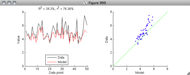
% Let's see an example of R^2 and r^2.
% Generate a sample dataset and a sample model.
data = 5 + randn(50,1);
model = .6*(data-5) + 4.5 + 0.3*randn(50,1);

% Now, calculate R^2 and r^2 and visualize.
R2 = calccod(model,data);
r2 = 100 * calccorrelation(model,data)^2;
figure(999); setfigurepos([100 100 600 220]); clf;
subplot(1,2,1); hold on;
h1 = plot(data,'k-');
h2 = plot(model,'r-');
axis([0 51 0 8]);
xlabel('Data point');
ylabel('Value');
legend([h1 h2],{'Data' 'Model'},'Location','South');
title(sprintf('R^2 = %.4g%%, r^2 = %.4g%%',R2,r2));
subplot(1,2,2); hold on;
h3 = scatter(model,data,'b.');
axis square; axis([0 8 0 8]); axissquarify; axis([0 8 0 8]);
xlabel('Model');
ylabel('Data');


% Notice that r^2 is larger than R^2.  The reason for this is that r^2
% implicitly includes offset and gain parameters.  To see this clearly,
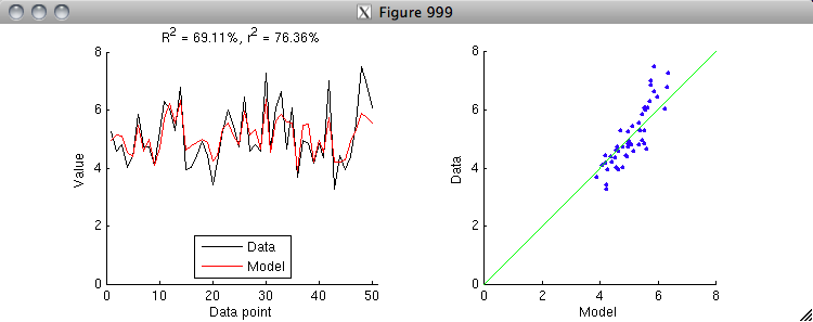
% let's first apply an explicit offset parameter to the model and
% re-run the "calculate and visualize" code above.
model = model - mean(model) + mean(data);


% Notice that by allowing the model to get the mean right, we have
% closed some of the gap between R^2 and r^2.  There is one more
% step: let's apply an explicit gain parameter to the model and
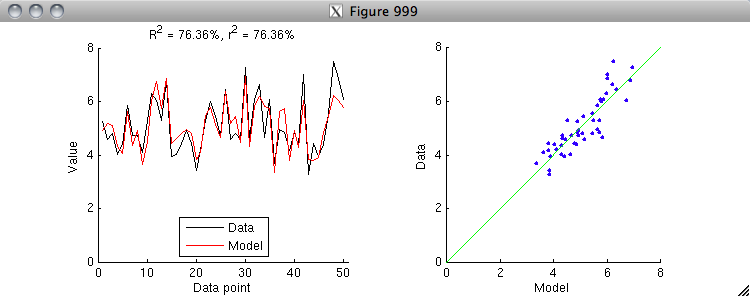
% re-run the "calculate and visualize" code above.  (To do this
% correctly, we have to estimate both the offset and gain
% simultaneously in a linear regression model.)
X = [model ones(size(model,1),1)];
h = inv(X'*X)*X'*data;
model = X*h;


% Aha, the R^2 value is now the same as the r^2 value.
% Thus, we see that r^2 is simply a special case of R^2
% where we allow an offset and gain to be applied
% to the model to match the data.  After applying
% the offset and gain, r^2 is equivalent to R^2.

% Note that because fitting an offset and gain will
% always reduce the residuals between the model and the data,
% r^2 will always be greater than or equal to R^2.

% In some cases, you might have a model that predicts the same
% value for all data points.  Such cases are not a problem for
% R^2 --- the calculation proceeds in exactly the same way as usual.
% However, note that such cases are ill-defined for r^2, because
% the variance of the model is 0 and division by 0 is not defined.

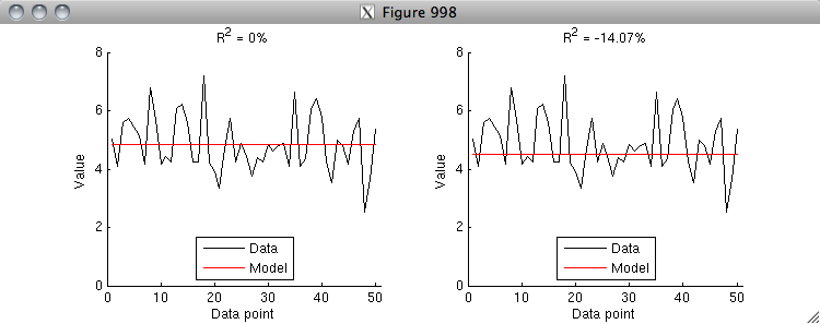
% An R^2 value of 0% has a special meaning --- you achieve 0% R^2
% if your model predicts the mean of the data correctly and does
% nothing else.  If your model gets the mean wrong, then you can
% quickly fall into negative R^2 values (i.e. your model is worse
% than a model that simply predicts the mean).  Here is an example.
data = 5 + randn(50,1);
model = repmat(mean(data),[50 1]);
R2 = calccod(model,data);
figure(998); setfigurepos([100 100 600 220]); clf;
subplot(1,2,1); hold on;
h1 = plot(data,'k-');
h2 = plot(model,'r-');
axis([0 51 0 8]);
xlabel('Data point');
ylabel('Value');
legend([h1 h2],{'Data' 'Model'},'Location','South');
title(sprintf('R^2 = %.4g%%',R2));
subplot(1,2,2); hold on;
model = repmat(4.5,[50 1]);
R2 = calccod(model,data);
h1 = plot(data,'k-');
h2 = plot(model,'r-');
axis([0 51 0 8]);
xlabel('Data point');
ylabel('Value');
legend([h1 h2],{'Data' 'Model'},'Location','South');
title(sprintf('R^2 = %.4g%%',R2));


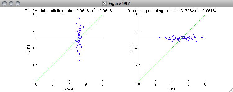
% Finally, note that R^2 is NOT symmetric (whereas r^2 is symmetric).
% The reason for this has to do with the gain issue.  Let's see an example.
data = 5 + randn(50,1);
regressor = data + 4*randn(50,1);
X = [regressor ones(50,1)];
h = inv(X'*X)*X'*data;
model = X*h;
r2 = 100 * calccorrelation(model,data)^2;
figure(997); setfigurepos([100 100 600 220]); clf;
subplot(1,2,1); hold on;
R2 = calccod(model,data);
h1 = scatter(model,data,'b.');
axis square; axis([0 8 0 8]); axissquarify; axis([0 8 0 8]);
straightline(mean(data),'h','k-');
xlabel('Model');
ylabel('Data');
title(sprintf('R^2 of model predicting data = %.4g%%; r^2 = %.4g%%',R2,r2));
subplot(1,2,2); hold on;
R2 = calccod(data,model);
h2 = scatter(data,model,'b.');
axis square; axis([0 8 0 8]); axissquarify; axis([0 8 0 8]);
straightline(mean(data),'h','k-');
xlabel('Data');
ylabel('Model');
title(sprintf('R^2 of data predicting model = %.4g%%; r^2 = %.4g%%',R2,r2));


% On the left is the correct ordering where the model is attempting to
% predict the data.  The variance in the data is represented by the scatter
% of the blue dots along the y-dimension.  The green line is the model fit,
% and it does a modest job at explaining some of the variance along the
% y-dimension.  It is useful to compare against the black line, which is the
% prediction of a baseline model that only and always predicts the mean of
% the data.  On the right is the incorrect ordering where the data is
% attempting to predict the model.  The variance in the model is represented
% by the scatter of the blue dots along the y-dimension.  The green line is
% the model fit, and notice that it does a horrible job at explaining the
% variance along the y-dimension (and hence explains the very low R^2 value).
% The black line is much closer to the data points than the green line.
%
% Basically, what is happening is that the gain is correct in the case at
% the left but is incorrect in the case at the right.  Because r^2
% normalizes out the gain, the r^2 value is the same in both cases.
% But because R^2 is sensitive to gain, it give very different results.
% To fix the case at the right, the gain on the quantity being used for
% prediction (the x-axis) needs to be greatly reduced so as to better
% match the quantity being predicted (the y-axis).