Sunday, October 30, 2011

Correlation (r)

Correlation is a basic and fundamental concept.  By 'correlation' I refer to Pearson's product-moment correlation (r), which I find to be most useful, but there are other versions of correlation.  In a nutshell, correlation is a single number ranging from -1 to 1 that summarizes how well one set of numbers predicts another set of numbers.

CODE

% Let's start with a simple example.
data = randnmulti(100,[10 6],[1 .6; .6 1],[3 1]);
figure(999); clf; hold on;
scatter(data(:,1),data(:,2),'r.');
axis square; axis([0 20 0 20]);
set(gca,'XTick',0:1:20,'YTick',0:1:20);
xlabel('X'); ylabel('Y');
title('Data');


% To compute the correlation, let's first standardize each
% variable, i.e. subtract off the mean and divide by the
% standard deviation.  This converts each variable into
% z-score units.
dataz = calczscore(data,1);
figure(998); clf; hold on;
scatter(dataz(:,1),dataz(:,2),'r.');
axis square; axis([-5 5 -5 5]);
set(gca,'XTick',-5:1:5,'YTick',-5:1:5);
xlabel('X (z-scored)'); ylabel('Y (z-scored)');


% We would like a single number that represents the relationship
% between X and Y.  Points that lie in the upper-right or lower-left
% quadrants support a positive relationship between X and Y (i.e.
% higher on X is associated with higher on Y), whereas points that
% lie in the upper-left or lower-right quadrants support a negative
% relationship between X and Y (i.e. higher on X is associated with
% lower on Y).
set(straightline(0,'h','k-'),'Color',[.6 .6 .6]);
set(straightline(0,'v','k-'),'Color',[.6 .6 .6]);
text(4,4,'+','FontSize',48,'HorizontalAlignment','center');
text(-4,-4,'+','FontSize',48,'HorizontalAlignment','center');
text(4,-4,'-','FontSize',60,'HorizontalAlignment','center');
text(-4,4,'-','FontSize',60,'HorizontalAlignment','center');


% Let's calculate the "average" relationship.  To do this, we compute
% the average product of the X and Y variables (in the z-scored space).
% The result is the correlation value.
r = mean(dataz(:,1) .* dataz(:,2));
title(sprintf('r = %.4g',r));


% Now, let's turn to a different (but in my opinion more useful)
% interpretation of correlation.  Let's start with a simple example.
data = randnmulti(100,[10 6],[1 .8; .8 1],[3 1]);

% For each set of values, subtract off the mean and scale the values such
% that the the values have unit length (i.e. the sum of the squares of the
% values is 1).
datanorm = unitlength(zeromean(data,1),1);

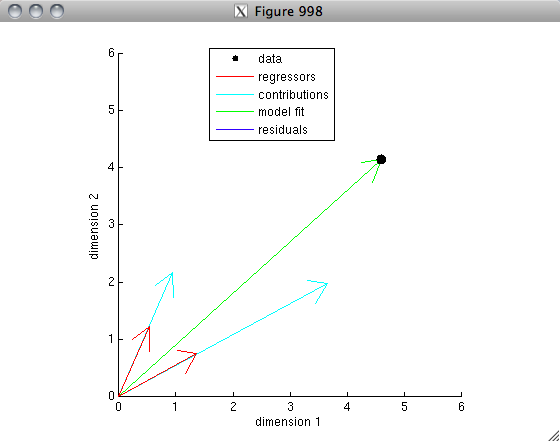
% The idea is that each set of values represents a vector in a
% 100-dimensional space.  After mean-subtraction and unit-length-normalization,
% the vectors lie on the unit sphere.  The correlation is simply
% the dot-product between the two vectors.  If the two vectors are
% very similar to one another, the dot-product will be high (close to 1);
% if the two vectors are not very similar to one another (think: randomly
% oriented), the dot-product will be low (close to 0); if the two vectors
% are very anti-similar to one another (think: pointing in opposite
% directions), the dot product will be very negative (close to -1).
% Let's visualize this for our example.
  % the idea here is to project the 100-dimensional space onto
  % two dimensions so that we can actually visualize the data.
  % the first dimension is simply the first vector.
  % the second dimension is the component of the second vector that
  % is orthogonal to the first vector.
dim1 = datanorm(:,1);
dim2 = unitlength(projectionmatrix(datanorm(:,1))*datanorm(:,2));
  % compute the coordinates of the two vectors in this reduced space.
c1 = datanorm(:,1)'*[dim1 dim2];
c2 = datanorm(:,2)'*[dim1 dim2];
  % make a figure
figure(997); clf; hold on;
axis square; axis([-1.2 1.2 -1.2 1.2]);
h1 = drawarrow([0 0; 0 0],[c1; c2],[],[],[],'LineWidth',4,'Color',[1 .8 .8]);
h2 = drawellipse(0,0,0,1,1,[],[],'k-');
h3 = plot([c2(1) c2(1)],[0 c2(2)],'k--');
h4 = plot([0 c2(1)],[0 0],'r-','LineWidth',4);
xlabel('Dimension 1');
ylabel('Dimension 2');
legend([h1(1) h2 h4],{'Data' 'Unit sphere' 'Projection'});
r = dot(datanorm(:,1),datanorm(:,2));
title(sprintf('r = %.4g',r));


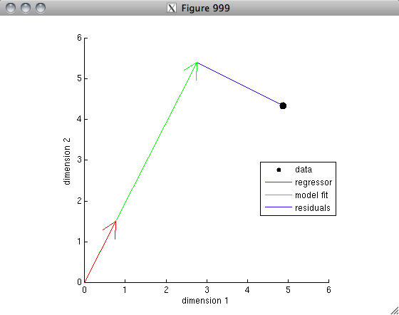
% The vector interpretation lends itself readily to the concept
% of variance explained.  Suppose that we are using one vector A
% to predict the other vector B in a linear regression sense.  Then,
% the weight applied to vector A is equal to the correlation
% value.  (This is because inv(A'*A)*A'*B = inv(1)*A'*B = A'*B = r.)
% Let's visualize this.
figure(996); clf; hold on;
axis square; axis([-1.2 1.2 -1.2 1.2]);
h1 = drawarrow([0 0],c2,[],[],[],'LineWidth',4,'Color',[1 0 0]);
h2 = drawarrow([0 0],r*c1,[],[],[],'LineWidth',4,'Color',[0 1 0]);
h3 = plot([r r],[0 c2(2)],'b-');
h4 = drawellipse(0,0,0,1,1,[],[],'k-');
text(.3,.38,'1');
text(.35,-.1,'r');
xlabel('Dimension 1');
ylabel('Dimension 2');
legend([h1 h2 h3 h4],{'Vector B' 'Vector A (scaled by r)' 'Residuals' 'Unit sphere'});


% So, we ask, how much variance in vector B is explained by vector A?
% The total variance in vector B is 1^2.  By the Pythagorean Theorem,
% the total variance in the residuals is 1^2 - r^2.  So, the fraction
% of variance that we do not explain is (1^2 - r^2) / 1^2, and
% so the fraction of variance that we do explain is 1 - (1^2 - r^2) / 1^2,
% which simplifies to r^2.  (Note that here, in order to keep things simple,
% we have invoked a version of variance that omits the division by the number
% of data points.  Under this version of variance, the variance associated
% with a zero-mean vector is simply the sum of the squares of the elements
% of the vector, which is equivalent to the square of the vector's length.
% Thus, there is a nice equivalence between variance and squared distance,
% which we have exploited for our interpretation.)

FINAL REMARKS

There is much more to be said about correlation; we have covered here only the basics.

One important caveat to keep in mind is that correlation is not sensitive to offset and gain.  This is because the mean of each set of numbers is subtracted off and because the scale of each set of numbers is normalized out.  This has several consequences:
  • Correlation indicates how well deviations relative to the mean can be predicted.  This is natural, since variance (normally defined) is also relative to the mean.
  • When using correlation as a index of how well one set of numbers predicts another set of numbers, you are implicitly allowing scale and offset parameters in your model. If you want to be completely parameter-free, you should instead use a metric like R^2 (which will be described in a later post).

Randomization tests

Randomization is a simple and intuitive method for establishing statistical significance. We provide here two examples in which a set of data is randomly shuffled multiple times, the results of which demonstrate that the original order of the data is in fact special.

CODE

% Let's generate a time-series with an upward linear trend,
% corrupted by a large amount of noise.
x = (1:50) + 30*randn(1,50);

% Visualize the time-series.
figure(999); clf;
plot(x);
xlabel('Time');
ylabel('Value');
title('Time-series data');


% Suppose we didn't know that the data came from a model
% with an upward trend.  How can we test whether the observed
% trend is statistically significant?

% Let's perform a randomization test.  The logic is as follows:
% The null hypothesis is that the data points have no dependence on
% time.  If the null hypothesis is true, then we can randomly permute
% the data points and this should produce datasets that are equivalent
% to the original dataset.  So, we will generate random datasets,
% compute a statistic from these datasets, and compare these values to
% the statistic generated from the original dataset.  Our statistic will
% be the correlation (Pearson's r) between the time-series and a diagonal line.
[pval,val,dist] = randomization(x,2,@(x) calccorrelation(x,1:length(x)),10000,1);

% What we have done is to compute correlation values for 10000 randomly permuted
% datasets.  Let's look at the distribution of correlation values obtained,
% and let's see where the original correlation value lies.
figure(998); clf; hold on;
hist(dist,100);
h = straightline(val,'v','r-');
xlabel('Correlation');
ylabel('Frequency');
legend(h,{'Actual correlation'});
title('Distribution of correlation values obtained via randomization');


% The random correlation values are most of the time less than the
% actual correlation value.  The proportion of time that the actual
% correlation value is greater than the random values is the p-value.
ax = axis;
text(val,1.05*ax(4),sprintf('p = %.4g',pval),'HorizontalAlignment','center');
axis([ax(1:2) ax(3) 1.1*ax(4)]);

% Given the unlikeliness of obtaining the correlation value that we did,
% we can conclude that the null hypothesis is probably false and that
% the data points probably do have a dependence on time.  (Note that
% strictly-speaking, we cannot claim that the specific form of the
% time-dependence is a linear trend; we can claim only that there is
% some dependence on time.)

% Let's do another example.  Generate points in a two-dimensional
% space with a weak correlation between the x- and y-coordinates.
data = randnmulti(500,[],[1 .1; .1 1]);

% Visualize the data.
figure(997); clf;
scatter(data(:,1),data(:,2),'r.');
xlabel('X');
ylabel('Y');
title(sprintf('Data (r = %.4g)',calccorrelation(data(:,1),data(:,2))));


% Let's perform a randomization test to see if there is a statistically
% significant relationship between the x- and y-coordinates.  If there is
% no relationship, then we can randomly permute the x-coordinates
% relative to the y-coordinates and this should produce datasets
% that are equivalent to the original dataset. Our statistic of
% interest will be the correlation (Pearson's r) between x- and
% y-coordinates of each dataset.
[pval,val,dist] = randomization(data(:,1),1,@(x) calccorrelation(x,data(:,2)),10000,1);

% What we have done is to compute correlation values for 10000 randomly permuted
% datasets.  Let's look at the distribution of correlation values obtained,
% and let's see where the original correlation value lies.
figure(996); clf; hold on;
hist(dist,100);
h = straightline(val,'v','r-');
xlabel('Correlation');
ylabel('Frequency');
legend(h,{'Actual correlation'});
title('Distribution of correlation values obtained via randomization');
ax = axis;
text(val,1.05*ax(4),sprintf('p = %.4g',pval),'HorizontalAlignment','center');
axis([ax(1:2) ax(3) 1.1*ax(4)]);


% The random correlation values are most of the time less than the
% actual correlation value.  The proportion of time that the actual
% correlation value is greater than the random values is the p-value.
% The null hypothesis (that there is no dependence between the x-
% and y-coordinates) is probably false.

Thursday, October 27, 2011

Correlated regressors

In ordinary least-squares linear regression, correlated regressors lead to unstable model parameter estimates.  The intuition is that given two correlated regressors, it is difficult to determine how much of the data is due to one regressor and how much is due to the other.  Let's look at this geometrically.

CODE

% Generate two regressors (in the columns of the matrix).
% These two regressors are relatively uncorrelated (nearly orthogonal).
X = [10 1;
       1 10];

% Generate some data (no noise has been added yet).
data = [24 25]';

% Simulate 100 measurements of the data (with noise added).
% For each measurement, estimate the weights on the regressors.
y = zeros(2,100);
h = zeros(2,100);
for rep=1:100
  y(:,rep) = data + 2*randn(2,1);
  h(:,rep) = inv(X'*X)*X'*y(:,rep);
end

% Estimate weights on the regressors for the case of no noise.
htrue = inv(X'*X)*X'*data;

% Now visualize the results
figure(999); clf; hold on;
h1 = scatter(y(1,:),y(2,:),'g.');
h2 = scatter(data(1),data(2),'k.');
axis square; axis([0 50 0 50]);
h3 = drawarrow(repmat([0 0],[2 1]),X','r-',[],10);
for p=1:size(X,2)
  h4 = scatter(X(1,p)*h(p,:),X(2,p)*h(p,:),25,'gx');
  h5 = scatter(X(1,p)*htrue(p),X(2,p)*htrue(p),'k.');
end
uistack(h3,'top');
h6 = drawarrow(X(:,1)',X(:,2)','b-',[],0);
xlabel('dimension 1');
ylabel('dimension 2');
legend([h1 h2 h3(1) h4 h5 h6], ...
       {'measured data' 'noiseless data' 'regressors' ...
        'estimated weights' 'true weights' 'difference between regressors'});


The green X's represent each regressor scaled by the weight estimated for that regressor in each of the 100 simulations.  The X's are indicative of how reliably we can estimate the weights.  In this example, the weights are estimated quite reliably (the spread of the X's is relatively small).

% Let's repeat the simulation but now with
% two regressors that are highly correlated.
X = [6 5;
       5 6];


In this example, the two regressors are highly correlated and weight estimation is unreliable.  To understand why this happens, examine the difference between the regressors.  Notice that the difference between the regressors is quite small.  Noise in the data shifts the data along this difference, giving rise to substantially different parameter estimates. For example, if the measured data shifts towards the upper-left, then this tends to produce high weights for the upper-left regressor (and low weights for the bottom-right regressor); if the measured data shifts towards the bottom-right, then this tends to produce high weights for the bottom-right regressor (and low weights for the upper-left regressor).

OBSERVATIONS

The stability of model parameter estimates is determined (in part) by the amount of noise in the direction of the regressor difference.  If the projection of the noise onto the regressor difference has small variance (as in the first example), then parameter estimates will tend to be stable; if the projection has large variance (as in the second example), then parameter estimates will tend to be unstable.

So how can we obtain better parameter estimates in the case of correlated regressors? One solution is to use regularization strategies (which will be described in a later post).

Tuesday, October 25, 2011

Geometric interpretation of linear regression

Linear regression can be given a nice intuitive geometric interpretation.

CODE

% Generate random data (just two data points)
y = 4+rand(2,1);

% Generate a regressor.
x = .5+rand(2,1);

% Our model is simply that the data can be explained, to some extent,
% by a scale factor times the regressor, e.g. y = x*c + n, where c is
% a free parameter and n represents the residuals.  Normally, we
% want the best fit to the data, that is, we want the residuals to be
% as small as possible (in the sense that the sum of the squares of
% of the residuals is as small as possible).  This can be given
% a nice geometric interpretation: the data is just a single point
% in a two-dimensional space, the regressor is a vector in this space,
% and we are trying to scale the vector to get as close to the data
% point as possible.
figure(999); clf; hold on;
h1 = scatter(y(1),y(2),'ko','filled');
axis square; axis([0 6 0 6]);
h2 = drawarrow([0 0],x','r-');
xlabel('dimension 1');
ylabel('dimension 2');

% Let's estimate the weight on the regressor that minimizes the
% squared error with respect to the data.
c = inv(x'*x)*x'*y;

% Now let's plot the model fit.
modelfit = x*c;
h3 = drawarrow([0 0],modelfit','g-');
uistack(h3,'bottom');

% Calculate the residuals and show this pictorially.
residuals = y - modelfit;
h4 = drawarrow(modelfit',y','b-',[],0);
uistack(h4,'bottom');

% Put a legend up
legend([h1 h2(1) h3 h4],{'data' 'regressor' 'model fit' 'residuals'});


% OK. Now's let's do an example for the case of two regressors.
% One important difference is that the model is now a weighted sum
% of the two regressors and so there are two free parameters.
y = 4+rand(2,1);
x = .5+rand(2,2);
figure(998); clf; hold on;
h1 = scatter(y(1),y(2),'ko','filled');
axis square; axis([0 6 0 6]);
h2 = drawarrow([0 0; 0 0],x','r-');
xlabel('dimension 1');
ylabel('dimension 2');
c = inv(x'*x)*x'*y;
modelfit = x*c;
h3 = drawarrow([0 0],modelfit','g-');
uistack(h3,'bottom');
residuals = y - modelfit;
h4 = drawarrow(modelfit',y','b-',[],0);
uistack(h4,'bottom');

% Each regressor makes a contribution to the final model fit,
% so let's plot the individual contributions.
h3b = [];
for p=1:size(x,2)
  contribution = x(:,p)*c(p);
  h3b(p) = drawarrow([0 0],contribution','c-');
end
uistack(h3b,'bottom');

% Finally, put a legend up
legend([h1 h2(1) h3b(1) h3 h4],{'data' 'regressors' 'contributions' 'model fit' 'residuals'});


OBSERVATIONS

In the first example, notice that the model fit lies at a right angle (i.e. is orthogonal) to the residuals. This makes sense because the model fit is the point (on the line defined by the regressor) that is closest in a Euclidean sense to the data.

In the second example, the model fits the data perfectly because there are as many regressors as there are data points (and the regressors are not collinear).

Sunday, October 23, 2011

Error in two dimensions

Regression normally attributes error to the dependent variable, but it is possible to fit regression models that attribute errors to both dependent and independent variables.

CODE

% Generate some random data points.
x = randn(1,1000);
y = randn(1,1000);

% Fit a line that minimizes the squared error between the y-coordinate of the data
% and the y-coordinate of the fitted line.  Bootstrap to see the variability of the fitted line.
paramsA = bootstrp(20,@(a,b) polyfit(a,b,1),x',y');

% Fit a line that minimizes the sum of the squared distances between the data points
% and the line.  Bootstrap to see the variability of the fitted line.
paramsB = bootstrp(20,@fitline2derror,x',y');

% Visualize the results.
figure(999); hold on;
scatter(x,y,'k.');
ax = axis;
for p=1:size(paramsA,1)
  h1 = plot(ax(1:2),polyval(paramsA(p,:),ax(1:2)),'r-');
  h2 = plot(ax(1:2),polyval(paramsB(p,:),ax(1:2)),'b-');
end
axis(ax);
xlabel('x');
ylabel('y');
title('Red minimizes squared error on y; blue minimizes squared error on both x and y');


% Now, let's repeat for a different dataset.
temp = randnmulti(1000,[],[1 .5; .5 1]);
x = temp(:,1)';
y = temp(:,2)';


OBSERVATIONS

First example: When minimizing error on y, the fitted lines tend to be horizontal. This is because the best that the model can do is to basically predict the mean y-value regardless of what the x-value is. When minimizing error on both x and y, all lines are basically equally bad, giving rise to wildly different line fits across different bootstraps.

Second example: In this example, minimizing error on y produces lines that are closer to horizontal than the lines produced by minimizing error on both x and y. Notice that the lines produced by minimizing error on both x and y are aligned with the intrinsic axes of the Gaussian cloud.

Error bar judgment

Error bars are useful because they allow us to figure out how much of the data is signal and how much of the data is noise. We want to pay attention to aspects of the data that are real (i.e. outside of the error) and discount aspects of the data that are due to chance (i.e. within the error). Error bars that reflect +/- 1 standard error are surprisingly aggressive (see below).

CODE

% We are going to measure 40 different conditions.
% For the first twenty conditions, the true signal will be 0.
% For the second twenty conditions, the true signal will be 1.
numconditions = 40;

% We will make 30 different measurements for each condition.
n = 30;

% Let's perform a simulation, visualize the results,
% and then do it again (ad nauseum).
while 1

  % these are the true signal values
  signal = [zeros(1,numconditions/2) ones(1,numconditions/2)];
 
  % this is the noise (random Gaussian noise)
  noise = randn(n,numconditions);
 
  % these are the measurements
  measurement = bsxfun(@plus,signal,noise);
 
  % given the measurements, let's calculate the mean
  % and standard error for each condition.
  mn = mean(measurement,1);
  se = std(measurement,[],1)/sqrt(n);

  % now, let's visualize the results
  figure(999); clf; hold on;
  bar(1:numconditions,mn);
  errorbar2(1:numconditions,mn,se,'v','r-','LineWidth',2);
  plot(1:numconditions,signal,'b-','LineWidth',2);
  axis([0 numconditions+1 -1 2]);
  title('Black is the mean; red is the standard error; blue is the true signal');
  pause;

end


OBSERVATIONS

If you use +/- 1 standard error to visualize results, it may subjectively look like there are differences, even though there aren't any. For this reason, it may be useful to instead plot error bars that reflect +/- 2 standard errors.

It is quite common to find measurements that are several error bars away from the true value.  Of course, this is completely expected given the nature of standard errors (e.g. 5% of the time, you will find a data point that is more than 2 standard errors away from the true value).