Sunday, November 27, 2011

Fitting probability distributions to data

Here we cover the very basics of probability distributions and how to fit them to data.  We will see that one way to fit a probability distribution is to determine the parameters of the distribution that maximize the likelihood of the data.

CODE

% Let's look at a basic probability distribution, the Gaussian
% distribution.  In the one-dimensional case, there are two parameters,
% the mean and the standard deviation.  Let's see an example.
mn = 3;
sd = 1;
fun = @(x) 1/(sd*sqrt(2*pi)) * exp(-(x-mn).^2/(2*sd^2));

% We have defined a function that takes a value and returns
% the corresponding likelihood for a Gaussian distribution with
% mean 3 and standard deviation 1.  This function is called
% a probability density function.  Let's visualize it.
figure(999); clf; hold on;
xx = -1:.01:7;
h1 = plot(xx,feval(fun,xx),'r-','LineWidth',2);
xlabel('Value');
ylabel('Likelihood');
legend(h1,{'Probability density function'});


% For a Gaussian distribution, about 95% of the time, values drawn
% from the distribution will lie within two standard deviations
% of the mean.  In our example, this range is between 1 and 5.
xx2 = linspace(mn-2*sd,mn+2*sd,100);
h2 = bar(xx2,feval(fun,xx2),1);
set(h2,'FaceColor',[.8 .8 .8]);
set(h2,'EdgeColor','none');
uistack(h1,'top');


% We have shaded in the area underneath the probability density function
% that lies between 1 and 5.  If we were to calculate the actual area
% of this region, we would find that it is (approximately) 0.95.
% The total area underneath the probability density function is 1.
delete(h2);

% Now let's consider the concept of calculating the likelihood of a
% set of data given a particular probability distribution.  Using
% our example Gaussian distribution (mean 3, standard deviation 1),
% let's calculate the likelihood of a sample set of data.
data = [2.5 3 3.5];
h3 = straightline(data,'v','b-');
likelihood = prod(feval(fun,data));
legend([h1 h3(1)],{'Probability density function' 'Data points'});
title(sprintf('Likelihood of data points = %.6f',likelihood));


% The likelihood of observing the data points 2.5, 3, and 3.5 is
% obtained by multiplying the likelihoods of each individual data
% point.  (We are assuming that the data points are independent.)
% Now, for comparison, let's calculate the likelihood of a different
% set of data.
delete(h3);
data = [4 4.5 5];
h3 = straightline(data,'v','b-');
likelihood = prod(feval(fun,data));
legend([h1 h3(1)],{'Probability density function' 'Data points'});
title(sprintf('Likelihood of data points = %.6f',likelihood));


% Notice that the likelihood of this new set of data is much smaller
% then that of the original set of data.

% Now that we know how to calculate the likelihood of a set of data
% given a particular probability distribution, we can now think about
% how to actually fit a probability distribution to a set of data.
% All that we need to do is to set the parameters of the probability
% distribution such that the likelihood of the set of data is maximized.

% Let's do an example.  We have several data points and we want to fit
% a univariate (one-dimensional) Gaussian distribution to the data.
% To determine the optimal mean and standard deviation parameters,
% let's use brute force.
data = randn(1,100)*2.5 + 4;
fun = @(pp) sum(-log(1/(abs(pp(2))*sqrt(2*pi)) * exp(-(data-pp(1)).^2/(2*pp(2)^2))));
options = optimset('Display','iter','FunValCheck','on', ...
                   'MaxFunEvals',Inf,'MaxIter',Inf,'TolFun',1e-6,'TolX',1e-6);
params = fminsearch(fun,[0 1],options);

% What we have done is to use fminsearch to determine the mean and standard
% deviation parameters that minimize the sum of the negative log likelihoods
% of the data points.  (Maximizing the product of the likelihoods of the data
% points is equivalent to maximizing the log of the product of the likelihoods
% of the data points, which is equivalent to maximizing the sum of the log of
% the likelihood of each data point, which is equivalent to minimizing the
% sum of the negative log likelihood of the data points.  Or, semi-formally:
%   Let <ps> be a vector of likelihoods.  Then,
%     max prod(ps) <=> max log(prod(ps))
%                  <=> max sum(log(ps))
%                  <=> min sum(-log(ps))
% Note that taking the log of the likelihoods helps avoid numerical
% precision issues.)  Let's visualize the results.
mn = params(1);
sd = abs(params(2));
fun = @(x) 1/(sd*sqrt(2*pi)) * exp(-(x-mn).^2/(2*sd^2));
figure(998); clf; hold on;
h2 = straightline(data,'v','k-');
ax = axis;
xx = linspace(ax(1),ax(2),100);
h1 = plot(xx,feval(fun,xx),'r-','LineWidth',2);
axis([ax(1:2) 0 max(feval(fun,xx))*1.1]);
xlabel('Value');
ylabel('Likelihood');
legend([h2(1) h1],{'Data' 'Model'});


% Let's take the mean and standard deviation parameters that we found
% using optimization and compare them to the mean and standard deviation
% of the data points.
params
[mean(data) std(data,1)]


% Notice that the two sets of results are more or less identical (the
% difference can be attributed to numerical precision issues).  Thus,
% we see that computing the mean and standard deviation of a set of
% data can be viewed as implicitly fitting a one-dimensional
% Gaussian distribution to the data.

Monday, November 21, 2011

Peeking at P-values

Guest Post by Jon
A common experimental practice is to collect data and then do a statistical test to evaluate whether the data differs significantly from a null hypothesis.  Sometimes researchers peek at the data before data collection is finished and do a preliminary analysis of the data. If a statistical test indicates a negative result, more data is collected; if there is a positive result, data collection is stopped. This strategy invalidates the statistical test by inflating the likelihood of observing a false positive.

In this post we demonstrate the amount of inflation obtained by this strategy. We sample from a distribution with a zero mean and test whether the sample mean differs from 0. As we will see, if we continually peek at the data, and then decide whether to continue data collection contingent on the partial results, we wind up with an elevated chance of rejecting the null hypothesis.

CODE
% Simulate 1000 experiments with 200 data points each
x = randn(200,1000);

% We expect about 5% false positives, given an alpha of 0.05
disp(mean(ttest(x, 0, 0.05)));

% Now let's calculate the rate of false positives for different sample
% sizes. We assume a minimum of 10 samples and a maximum of 200.
h = zeros(size(x));
for ii = 10:200
    h(ii,:) = ttest(x(1:ii, :), 0, 0.05);
end

% The chance of a false positive is about 0.05, no matter how many data points
figure(99);
plot(1:200, mean(h, 2), 'r-', 'LineWidth', 2)
ylim([0 1])
ylabel('Probability of a false positive')
xlabel('Number of samples')


% How would the false positive rate change if we peeked at the data?
% To simulate peeking, we take the cumulative sum of h values for each
% simulation. The result of this is that if at any point we reject the null
% (h=1), the remaining points for that simulation also assume we rejected
% null.
peekingH = logical(cumsum(h));

figure(99); hold on
plot(1:200, mean(peekingH, 2), 'k-', 'LineWidth', 2)
legend('No peeking', 'Peeking')

% The plot demonstrates the problem with peeking: we defined the likelihood
% of a false positive as our alpha value (here, 0.05), but we have created
% a false positive rate that is much higher.

Saturday, November 19, 2011

Nonparametric probability distributions

Parametric probability distributions (e.g. the Gaussian distribution) make certain assumptions about the distribution of a set of data. Instead of making these assumptions, we can use nonparametric methods to estimate probability distributions (such methods include bootstrapping, histograms, and kernel density estimation).

CODE

% Generate some data points.
x = 4 + randn(1,100).^2 + 0.2*randn(1,100);

% Let's visualize the data.
figure(999); clf; hold on;
axis([0 12 0 0.8]); ax = axis;
h1 = straightline(x,'v','r-');
xlabel('Value');
ylabel('Probability');


% We have drawn a vertical line at each data point.
% Imagine that the vertical lines collectively
% define a probability distribution that has a value
% of 0 everywhere except for the data points
% where there are infinitely high spikes.  This
% probability distribution is what the bootstrapping
% method is in fact implicitly using --- drawing
% random samples with replacement from the
% original data is equivalent to treating the data
% points themselves as defining the probability
% distribution estimate.

% Now let's construct a histogram.
[nn,cc] = hist(x,20);
binwidth = cc(2)-cc(1);
h2 = bar(cc,nn/sum(nn) * (1/binwidth),1);


% The histogram is a simple nonparametric method for
% estimating the probability distribution associated with
% a set of data.  It is nonparametric because it makes
% no assumption about the shape of the probability
% distribution.  Note that we have scaled the histogram
% in such a way as to ensure that the area occupied by
% the histogram equals 1, which is a requirement for
% true probability distributions.

% The simplest and most common method for summarizing a
% set of data is to compute the mean and standard deviation
% of the data.  This can be seen as using a parametric
% probability distribution, the Gaussian distribution,
% to interpret the data.  Let's make this connection
% explicit by plotting a Gaussian probability distribution
% whose mean and standard deviation are matched to that
% of the data.
mn = mean(x);
sd = std(x);
xx = linspace(ax(1),ax(2),100);
h3 = plot(xx,evalgaussian1d([mn sd 1/(sd*sqrt(2*pi)) 0],xx),'g-','LineWidth',2);


% Notice that the Gaussian distribution is reasonably
% matched to the data points and the histogram but tends
% to overestimate the data density at low values.

% The histogram is a crude method since the probability
% distributions that it creates have discontinuities (the
% corners of the black rectangles).  To avoid discontinuities,
% we can instead use kernel density estimation.  In this method,
% we place a kernel at each data point and sum across the
% kernels to obtain the final probability distribution estimate.
% Let's apply kernel density estimation to our example using
% a Gaussian kernel with standard deviation 0.5.  (To ensure
% visibility, we have made the height of each kernel higher than
% it actually should be.)
kernelwidth = 0.5;
vals = [];
h4 = [];
for p=1:length(x)
  vals(p,:) = evalgaussian1d([x(p) kernelwidth 1/(kernelwidth*sqrt(2*pi)) 0],xx);
  h4(p) = plot(xx,1/10 * vals(p,:),'c-');
end
h5 = plot(xx,mean(vals,1),'b-','LineWidth',2);
  % Note that we could have used MATLAB's ksdensity function to achieve
  % identical results:
  % vals = ksdensity(x,xx,'width',0.5);
  % h5 = plot(xx,vals,'b-');

% Finally, add a legend.
legend([h1(1) h2(1) h3(1) h4(1) h5(1)],{'Data' 'Histogram' 'Gaussian' 'Kernels' 'Kernel Density Estimate'});


% Notice that the kernel density estimate is similar to the histogram, albeit smoother.

ADDITIONAL ISSUES

When constructing histograms, a free parameter is the number of bins to use.  Typically, histograms are used as an exploratory method, so it would be quite acceptable to try out a variety of different values (so as to get a sense of what the data are like).

Notice that the number of bins used in a histogram is analogous to the width of the kernel used in kernel density estimation.

How do we choose the correct kernel width in kernel density estimation?  If the kernel is too small, then we risk gaps in the resulting probability distribution, which is probably not representative of the true distribution.  If the kernel is too large, then the resulting probability distribution will tend towards being uniform, which is also probably not representative of the true distribution.  We will address selection of kernel width in a later post, but the short answer is that we can use cross-validation to choose the optimal kernel width.

Saturday, November 12, 2011

Error bars on standard deviations

We are often concerned with estimating the mean of a population. Given that we can obtain only a limited number of samples from the population, what we normally do is to compute the mean of the samples and then put an error bar on the mean.

Now, sometimes we might be interested in the standard deviation of the population. Notice that the exact same problem arises --- with a limited number of samples from the population, we can obtain an estimate of the standard deviation of the population (by simply computing the standard deviation of the samples), but this is just an estimate. Thus, an error bar can be put on the standard deviation, too.

CODE

% Let's perform a simulation. For several different sample sizes,
% we draw random samples from a normal distribution with mean 0
% and standard deviation 1. For each random sample, we compute
% the standard deviation of the sample. We then look at the
% distribution of the standard deviations across repeated simulations.
nn = 8;
ns = 2.^(1:nn);
cmap = cmapdistinct(nn);
figure(999); setfigurepos([100 100 700 250]); clf;
subplot(1,2,1); hold on;
h = []; sd = [];
for p=1:length(ns)
x = randn(100000,ns(p));
dist = std(x,[],2);
[n,x] = hist(dist,100);
h(p) = plot(x,n,'-','Color',cmap(p,:));
sd(p) = std(dist);
end
ax = axis;
legend(h,cellfun(@(x) ['n = ' x],mat2cellstr(ns),'UniformOutput',0));
xlabel('Standard deviation');
ylabel('Frequency');
title('Standard deviations obtained using different sample sizes');
subplot(1,2,2); hold on;
h2 = plot(1:nn,sd,'r-');
ax = axis; axis([0 nn+1 ax(3:4)]);
set(gca,'XTick',1:nn,'XTickLabel',mat2cellstr(ns));
xlabel('n');
ylabel('Standard deviation of distribution');
title('Spread of standard deviation estimates');


% Notice that with few data points, the standard deviations are highly variable.
% With increasing numbers of data points, the standard deviations are more tightly
% clustered around the true value of 1.
%
% To put some concrete numbers on this: at n = 32, the spread in the distribution
% (which we quantify using standard deviation) is about 0.12. This indicates that
% if we draw 32 data points from a normal distribution and compute the standard
% deviation of the data points, our standard deviation estimate is accurate only
% to about +/- 12%.

FINAL OBSERVATIONS

Recall that the standard error of the mean for a random sample drawn from a Gaussian distribution is simply the standard deviation of the sample divided by the square root of the number of data points. Notice that in computing the standard error estimate, we are implicitly estimating the standard deviation of the population. But we have just seen that this standard deviation estimate may be somewhat inaccurate, depending on the number of data points. This implies that standard errors are themselves subject to noise.

To put it simply: we can put error bars on error bars. The error on error bars will tend to be high in the case of few data points.

Tuesday, November 8, 2011

Testing null hypotheses using randomization, the bootstrap, and Monte Carlo methods

Earlier we saw how randomization can be used to test the null hypothesis that there is no meaningful order in a set of data. This is actually just a special case of the general statistical strategy of using randomness to see what happens under various null hypotheses. This general statistical strategy covers not only randomization methods but also Monte Carlo methods and the bootstrap.  Let's look at some examples.

Example 1: Using randomization to test whether two sets of data are different (e.g. in their means)

In this example, we use randomization to check whether two sets of data come from different probability distributions. Let's pose the null hypothesis that the two sets of data actually come from the same probability distribution. Under this hypothesis, the two sets of data are interchangeable, so if we aggregate the data points and randomly divide the data points into two sets, then the results should be comparable to results obtained from the original data.

% Generate two sets of data.
x = randn(1,100) + 1.4;
y = randn(1,100) + 1;

% Let's aggregate the data, randomly divide the data, and compute the resulting
% differences in means.  And for comparison, let's compute the actual difference in means.
[pval,val,dist] = randomization([x y],2,@(a) mean(a(1:100))-mean(a(101:200)),10000,0);

% Visualize the results.
figure(999); clf; hold on;
hist(dist,100);
h1 = straightline(val,'v','r-');
ax = axis; axis([-.8 .8 ax(3:4)]);
xlabel('Difference in the means');
ylabel('Frequency');
legend(h1,{'Actual observed value'});
title(sprintf('Results obtained using random assignments into two groups; p (two-tailed) = %.4f',pval));


% We see that the actual difference in means, 0.525, is quite unlikely with respect
% to the differences in means obtained via randomization.  The p-value is 0.0002,
% referring to the proportion of the distribution that is more extreme than the
% actual difference in means.  (Since we don't have an a priori reason to expect
% a positive or negative difference, we use a two-tailed p-value --- that is,
% not only do we count the number of values greater than 0.525, but we also count
% the number of values less than -0.525.)  Thus, the null hypothesis is probably
% incorrect.

% Note that strictly speaking, we have not shown that the two sets of data come
% from probability distributions with different means --- all we have done is to
% reject the hypothesis that the sets of data come from the same probability
% distribution.

Example 2: Using the bootstrap to test whether two sets of data are different (e.g. in their means)

In the previous example, we posed the null hypothesis that the two sets of data come from the same distribution and then used randomization to generate new datasets.  Notice that instead of using randomization to generate new datasets, we can use the bootstrap.  The difference is that in the case of randomization, we enforce the fact that none of the data points are repeated within a set of data nor across the two sets of data, whereas in the case of the bootstrap, we do not enforce these constraints --- we generate new datasets by simply drawing data points with replacement from the original set of data.  (The bootstrap strategy seems preferable as it probably generates more representative random samples, but this remains to be proven...)

% Let's go through an example using the same data from Example 2.
% Aggregate the data, draw bootstrap samples, and compute the resuling
% differences in means.
dist = bootstrap([x y],@(a) mean(a(1:100)) - mean(a(101:200)),10000);

% Compute the actual observed difference in means as well as the corresponding p-value.
val = mean(x) - mean(y);
pval = sum(abs(dist) > abs(val)) / length(dist);

% Visualize the results.
figure(998); clf; hold on;
hist(dist,100);
h1 = straightline(val,'v','r-');
ax = axis; axis([-.8 .8 ax(3:4)]);
xlabel('Difference in the means');
ylabel('Frequency');
legend(h1,{'Actual observed value'});
title(sprintf('Results obtained using bootstraps of aggregated data; p (two-tailed) = %.4f',pval));


% We find that the actual difference in means is quite unlikely with respect
% to the differences in means obtained via bootstrapping.  Moreover, the p-value is
% quite similar to that obtained with the randomization method.

Example 3: Using Monte Carlo simulations to test whether a sequence of numbers is different from noise

The randomization (Example 1) and bootstrap (Example 2) methods that we have seen depend on having an adequate number of data points.  With sufficient data points, the empirical data distribution can serve as a reasonable proxy for the true data distribution.  However, when the number of data points is small, the empirical data distribution may be a poor proxy for the true data distribution and so statistical procedures based on the empirical data distribution may suffer.

One way to reduce dependencies on the empirical data distribution is to bring in assumptions (e.g. priors) on what the true data distribution is like.  For example, one simple assumption is that the data follows a Gaussian distribution.  Let's look at an example.

% Suppose we observe the following data, where the x-axis is an
% independent variable (ranging from 1 to 5) and the y-axis
% is a dependent (measured) variable.
x = [1.5 3.2 2 2.5 4];
figure(997); clf; hold on;
scatter(1:5,x,'ro');
axis([0 6 0 6]);
xlabel('Independent variable');
ylabel('Dependent variable');
val = calccorrelation(1:5,x);
title(sprintf('r = %.4g',val));


% Although the observed correlation is quite high, how do we know
% the data aren't just random noise?  Let's be more precise:
% Let's pose the null hypothesis that the data are simply random
% draws from a fixed Gaussian distribution.  Under this hypothesis,
% what are correlation values that we would expect to obtain?
% For sake of principles, let's take random draws from a
% Gaussian distribution matched to the observed data with respect
% to mean and standard deviation, although because correlation is
% insensitive to gain and offset, matching the observed data
% in terms of mean and standard deviation is not actually necessary.
fake = mean(x) + std(x)*randn(10000,5);
dist = calccorrelation(repmat(1:5,[10000 1]),fake,2);
pval = sum(dist > val) / length(dist);
figure(996); clf; hold on;
hist(dist,100);
h1 = straightline(val,'v','r-');
xlabel('Correlation');
ylabel('Frequency');
legend(h1,{'Actual observed correlation'});
title(sprintf('Results obtained using Monte Carlo simulations; p (one-tailed) = %.4f',pval));


% Notice that the p-value is just 0.10, which means that about 10% of the time,
% purely random data would result in a correlation value as extreme as the
% one actually observed.  Thus, the null hypothesis that the data are purely
% random Gaussian data is somewhat likely.

Wednesday, November 2, 2011

Coefficient of determination (R^2)

For the purposes of model evaluation, it is preferable to use coefficient of determination (R^2) as opposed to correlation (r) or squared correlation (r^2).  This is because correlation implicitly includes offset and gain parameters in the model.  Instead of using correlation, the proper approach is to estimate the offset and gain parameters as part of the model-building process and then to use a metric (like R^2) that is sensitive to offset and gain.  Note that when using R^2, getting the offset and gain estimated accurately is extremely important (otherwise, you can obtain low or even negative R^2 values).

CONCEPTS

In a previous post on correlation, we saw that the correlation between two sets of numbers is insensitive to the offset and gain of each set of numbers.  Moreover, we saw that if you are using correlation as a means for measuring how well one set of numbers predicts another, then you are implicitly using a linear model with free parameters (an offset parameter and a gain parameter).  This implicit usage of free parameters may be problematic --- two potential models may yield the same correlation even though one model gets the offset and gain completely wrong.  What we would like is a metric that does not include these implicit parameters.  A good choice for such a metric is the coefficient of determination (R^2), which is closely related to correlation.

Let <model> be a set of numbers that is a candidate match for another set of numbers, <data>.  Then, R^2 is given by:
  100 * (1 - sum((model-data).^2) / sum((data-mean(data)).^2))
There are two main components of this formula.  The first component is the sum of the squares of the residuals (which are given by model-data).  The second component is the sum of the squares of the deviation of the data points from their mean (this is the same as the variance of the data, up to a scale factor).  So, intuitively, R^2 quantifies the size of the residuals relative to the size of the data and is expressed in terms of percentage.  The metric is bounded at the top at 100% (i.e. zero residuals) and is unbounded at the bottom (i.e. there is no limit on the size of the residuals).  This stands in contrast to the metric of r^2, which is bounded between -100% and 100%.

CODE

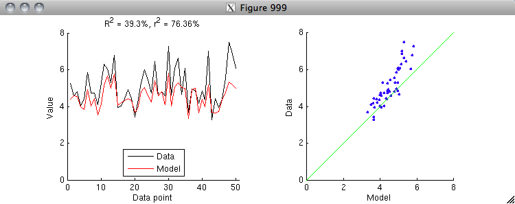
% Let's see an example of R^2 and r^2.
% Generate a sample dataset and a sample model.
data = 5 + randn(50,1);
model = .6*(data-5) + 4.5 + 0.3*randn(50,1);

% Now, calculate R^2 and r^2 and visualize.
R2 = calccod(model,data);
r2 = 100 * calccorrelation(model,data)^2;
figure(999); setfigurepos([100 100 600 220]); clf;
subplot(1,2,1); hold on;
h1 = plot(data,'k-');
h2 = plot(model,'r-');
axis([0 51 0 8]);
xlabel('Data point');
ylabel('Value');
legend([h1 h2],{'Data' 'Model'},'Location','South');
title(sprintf('R^2 = %.4g%%, r^2 = %.4g%%',R2,r2));
subplot(1,2,2); hold on;
h3 = scatter(model,data,'b.');
axis square; axis([0 8 0 8]); axissquarify; axis([0 8 0 8]);
xlabel('Model');
ylabel('Data');


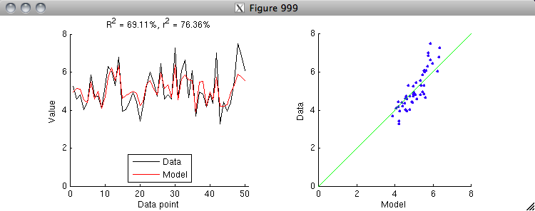
% Notice that r^2 is larger than R^2.  The reason for this is that r^2
% implicitly includes offset and gain parameters.  To see this clearly,
% let's first apply an explicit offset parameter to the model and
% re-run the "calculate and visualize" code above.
model = model - mean(model) + mean(data);


% Notice that by allowing the model to get the mean right, we have
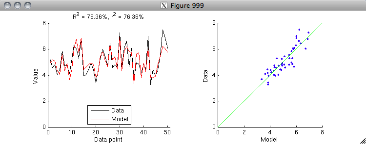
% closed some of the gap between R^2 and r^2.  There is one more
% step: let's apply an explicit gain parameter to the model and
% re-run the "calculate and visualize" code above.  (To do this
% correctly, we have to estimate both the offset and gain
% simultaneously in a linear regression model.)
X = [model ones(size(model,1),1)];
h = inv(X'*X)*X'*data;
model = X*h;


% Aha, the R^2 value is now the same as the r^2 value.
% Thus, we see that r^2 is simply a special case of R^2
% where we allow an offset and gain to be applied
% to the model to match the data.  After applying
% the offset and gain, r^2 is equivalent to R^2.

% Note that because fitting an offset and gain will
% always reduce the residuals between the model and the data,
% r^2 will always be greater than or equal to R^2.

% In some cases, you might have a model that predicts the same
% value for all data points.  Such cases are not a problem for
% R^2 --- the calculation proceeds in exactly the same way as usual.
% However, note that such cases are ill-defined for r^2, because
% the variance of the model is 0 and division by 0 is not defined.

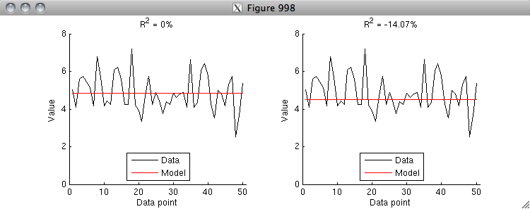
% An R^2 value of 0% has a special meaning --- you achieve 0% R^2
% if your model predicts the mean of the data correctly and does
% nothing else.  If your model gets the mean wrong, then you can
% quickly fall into negative R^2 values (i.e. your model is worse
% than a model that simply predicts the mean).  Here is an example.
data = 5 + randn(50,1);
model = repmat(mean(data),[50 1]);
R2 = calccod(model,data);
figure(998); setfigurepos([100 100 600 220]); clf;
subplot(1,2,1); hold on;
h1 = plot(data,'k-');
h2 = plot(model,'r-');
axis([0 51 0 8]);
xlabel('Data point');
ylabel('Value');
legend([h1 h2],{'Data' 'Model'},'Location','South');
title(sprintf('R^2 = %.4g%%',R2));
subplot(1,2,2); hold on;
model = repmat(4.5,[50 1]);
R2 = calccod(model,data);
h1 = plot(data,'k-');
h2 = plot(model,'r-');
axis([0 51 0 8]);
xlabel('Data point');
ylabel('Value');
legend([h1 h2],{'Data' 'Model'},'Location','South');
title(sprintf('R^2 = %.4g%%',R2));


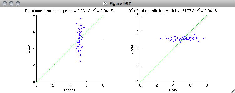
% Finally, note that R^2 is NOT symmetric (whereas r^2 is symmetric).
% The reason for this has to do with the gain issue.  Let's see an example.
data = 5 + randn(50,1);
regressor = data + 4*randn(50,1);
X = [regressor ones(50,1)];
h = inv(X'*X)*X'*data;
model = X*h;
r2 = 100 * calccorrelation(model,data)^2;
figure(997); setfigurepos([100 100 600 220]); clf;
subplot(1,2,1); hold on;
R2 = calccod(model,data);
h1 = scatter(model,data,'b.');
axis square; axis([0 8 0 8]); axissquarify; axis([0 8 0 8]);
straightline(mean(data),'h','k-');
xlabel('Model');
ylabel('Data');
title(sprintf('R^2 of model predicting data = %.4g%%; r^2 = %.4g%%',R2,r2));
subplot(1,2,2); hold on;
R2 = calccod(data,model);
h2 = scatter(data,model,'b.');
axis square; axis([0 8 0 8]); axissquarify; axis([0 8 0 8]);
straightline(mean(data),'h','k-');
xlabel('Data');
ylabel('Model');
title(sprintf('R^2 of data predicting model = %.4g%%; r^2 = %.4g%%',R2,r2));


% On the left is the correct ordering where the model is attempting to
% predict the data.  The variance in the data is represented by the scatter
% of the blue dots along the y-dimension.  The green line is the model fit,
% and it does a modest job at explaining some of the variance along the
% y-dimension.  It is useful to compare against the black line, which is the
% prediction of a baseline model that only and always predicts the mean of
% the data.  On the right is the incorrect ordering where the data is
% attempting to predict the model.  The variance in the model is represented
% by the scatter of the blue dots along the y-dimension.  The green line is
% the model fit, and notice that it does a horrible job at explaining the
% variance along the y-dimension (and hence explains the very low R^2 value).
% The black line is much closer to the data points than the green line.
%
% Basically, what is happening is that the gain is correct in the case at
% the left but is incorrect in the case at the right.  Because r^2
% normalizes out the gain, the r^2 value is the same in both cases.
% But because R^2 is sensitive to gain, it give very different results.
% To fix the case at the right, the gain on the quantity being used for
% prediction (the x-axis) needs to be greatly reduced so as to better
% match the quantity being predicted (the y-axis).